
Scroll through profiles tagged as “VIP” and the same bio keeps reappearing. A crown. A name in a stretched display font. A date of birth written like a legal document. A location pin. One line of attitude borrowed from a quote page.
That repetition is worth looking at. The VIP bio is a format with a grammar, an origin and a set of unwritten rules, and in its most common form it is a costume that works against the person wearing it.
What follows is the format broken down: what each element signals, what the technical limits are, why the fancy fonts carry a hidden cost, and how to build a bio that does the same job without copying anyone.
What a VIP bio means
Three different things get called “VIP” on Instagram, and separating them makes everything afterwards easier.
| Type | What it is | Who controls it | What it does |
| Verified | The blue check on the profile | Meta | Confirms identity, deters impersonation |
| Styled (VIP) | Decorated, symbol-heavy bio text | The account holder | Signals taste and status to visitors |
| Optimised | Clear, searchable, action-oriented text | The account holder | Improves discovery, follows and clicks |
A bio can be all three at once, and the strongest ones usually are. It can also be heavily styled and completely useless, which is what happens when a format gets copied without being understood.
Where the format came from
The VIP bio spread the way slang spreads by screenshot, imitation and small mutations. Its strongest roots are in South and Southeast Asian Instagram culture, particularly India, Pakistan, Bangladesh and Indonesia, where the word “VIP” already carried commercial weight. VIP mobile numbers with repeating digits sell at a premium. VIP registration plates are a recognised status purchase. VIP entry and VIP lounge appear on everything from wedding halls to bus tickets.
When that vocabulary moved online it landed on the one piece of writing every visitor to a profile reads. Two forces then shaped the look:
• The Facebook “stylish name” era set the precedent. Decorated profile names were already being generated with Unicode converters years earlier, and the habit paste plain text in, copy fancy output back carried straight over.
• Generator websites standardised the vocabulary. They offer the same handful of styles and the same symbol trays, so millions of people designing a bio independently were choosing from an identical menu. That is why crowns, hearts, small stars and arrow dividers dominate.
The result is a format that feels personal to whoever assembles it and looks mass-produced to anyone scrolling past a hundred of them.
The anatomy: seven building blocks
Almost every VIP bio is assembled from the same seven components. Few bios have room for all of them, but knowing what each one does turns copying into composing.
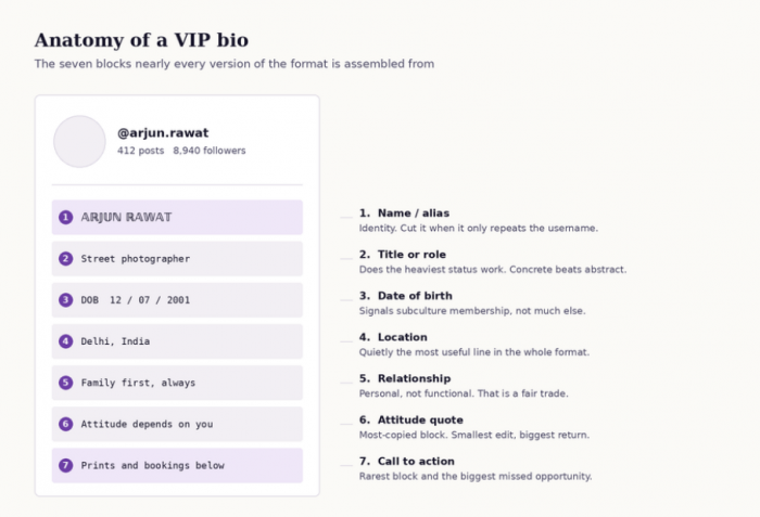
1. Name or alias. Answers “who is this” before anything else loads. It earns its place only when the name adds something the username does not already give.
2. Title or role. The block doing the heaviest status work, because a title claims a position. “Wedding photographer, Jaipur” and “Living my dream” take the same space and carry very different weight.
3. Date of birth. The most imitated element of the format and the least functional. It signals membership of the VIP bio subculture more than anything about the person.
4. Location. Quietly useful. It gives a stranger context for everything else, and for anyone taking bookings it answers a practical question in about twelve characters.
5. Relationship or loyalty. Anniversary dates, initials, a line about family or faith. Personal rather than functional, and that is a fair trade.
6. Attitude quote. The block most often copied wholesale, and the one where a small edit returns the most a specific line is instantly more memorable than a borrowed one.
7. Call to action. Rare in traditional VIP bios. A bio can look immaculate and still send every visitor away without asking them to do anything.
| Block | Keep it when | Cut it when |
| Name line | The handle is cryptic | It repeats the username |
| Title | It names something real | It is a vague slogan |
| Date of birth | The account is purely personal | The account has any business use |
| Location | Nearly always | Privacy is the priority |
| Relationship | It matters personally | Space is tight |
| Attitude quote | The line is specific | It was copied unchanged |
| Call to action | There is anything to click | There genuinely is not |
The technical rules
Design decisions get easier once the hard limits are clear.
| Field | Limit | What to know |
| Bio text | 150 characters | Letters, numbers, spaces, punctuation, emoji and line breaks all count against it. |
| Name field | 30 characters | Separate from both the bio and the username, and the field that matters most for being found by name. |
| Username | 30 characters | Letters, numbers, full stops and underscores only. |
| Profile links | Up to 5 | Displayed as plain stacked URLs, with no descriptions or images. |
| Line breaks | No separate limit | Each break consumes one character from the 150. |
Emoji are not free. A plain letter costs one character, but many emoji are stored as multiple code units, and skin-tone or combination emoji cost more still. A bio that looks like it should fit at 140 characters can refuse to save.
The 150 is a shared budget. Every symbol, divider and blank line is drawn from the same pool as the words. Four decorative dividers cost roughly the space a full call to action needs.
The bio works best when the name field, links and profile details carry part of the message too, rather than forcing everything into 150 characters. A broader Instagram bio guide helps show how those pieces fit together.
Instagram adjusts profile features periodically. These limits are current as of 2026, but the name field, link behaviour and search rules have all changed before.
The fancy font trap
The stylish fonts used in VIP bios are not fonts. Instagram offers no font picker, and no generator installs a typeface. What those sites do is swap each ordinary letter for a visually similar character from elsewhere in Unicode mathematical letters, circled letters, fullwidth letters, characters from unrelated writing systems.
To the eye it reads as a stylised A. To software it is a different character that happens to look like one. That has four practical consequences.
• Search treats it as a different word. Someone typing the real name in plain letters is not typing the string the profile contains, so the account becomes harder to surface by name.
• Screen readers struggle with it. Assistive software may read these characters one at a time, announce them by their formal Unicode names, or skip them entirely.
• Rendering is inconsistent. A substituted character only displays if the device has a font covering that Unicode block. On older Android builds and some desktop browsers, parts of the bio collapse into empty boxes invisible to the person who wrote it, since their own phone renders it perfectly.
• Nobody can retype it. A friend searching for the account has no way to produce those characters on a normal keyboard.
Fancy fonts are not banned. They are just expensive, and the price is paid in a currency most people never check.
The answer is not to abandon styling but to spend it where it costs least. The name field does the discovery work, so it stays in plain, typeable characters. The bio body is where decoration can live, because it carries far less search weight.
Bios by persona
A bio only works in context. What reads as premium on a photography account reads as empty on a student account.
Business owner
Specificity is the status signal. Naming the industry, the city and the route to contact does more for credibility than any crown.
♛ Founder [Brand Name]
▸ Built in [City]
Helping [audience] get [outcome]
✉ DM for orders
Running [industry] since 20XX
No shortcuts. No excuses.
↓ Catalogue below
Content creator
Creators are being assessed for collaborations, so the niche and the contact route need to be obvious within two seconds.
[Niche] content, 3x a week
✉ Collabs: [email]
Latest upload ↓
Student
Personal accounts do not need a value proposition, but one real detail beats three borrowed lines.
[Course] @ [College]
Born [DOB]
Coffee, cricket, chaos
Gamer
Ranks, IDs and platforms carry the proof here. Numbers do the persuading.
[Game] | [Rank]
UID: [number]
Live most nights ↓
Musician or artist
The only thing a visitor needs is somewhere to hear or see the work.
Producer | [Genre]
New track out now
Listen ↓
[Medium] artist
Commissions open
Portfolio below
Fitness
These accounts live on whether a visitor believes the person knows what they are doing. Credentials beat slogans.
Certified [certification]
Trained [number]+ clients
✉ Coaching enquiries
Photographer
Genre and location are the two facts a potential client checks first.
Wedding & portrait
Available across [region]
Bookings via DM
Traveller
A counter gives the bio instant substance and updates itself as a reason to revisit.
[number] countries, still counting
Currently: [place]
Guides in highlights
Private or minimal
Restraint is the strongest VIP signal available, and it costs nothing.
[Initial] · [City]
No captions. No explanations.
Bios by mood
Every line below has been read by other people. Changing at least two words a city, a number, a name, a specific detail is what keeps a bio from being identical to several thousand others.
Royal
• Built the throne before I sat on it
• Royalty is a habit, not a title
• Crown fits. Nobody handed it over.
• Quiet rooms, loud results
Attitude
• Not everyone’s cup of tea. I’m someone’s whole bar.
• I don’t chase. I replace.
• Standards high, patience low
• Same energy you bring, doubled
Classy and minimal
• Less noise, better work
• [Name] · [City]
• Simple taste, expensive standards
• Understated on purpose
Motivational
• Started at zero, still counting up
• Discipline beats motivation every morning
• Building something worth the wait
• One percent, daily, no exceptions
Savage
• I was the problem. Now I’m the standard.
• Blocked more people than I’ve followed
• Sorry for the delay, I was busy
Funny
• Professional overthinker, certified snack enthusiast
• I peaked in the group chat
• Currently accepting food, not advice
Soft
• Healing loudly, living quietly
• Some chapters stay unread
• Still soft. Still standing.
One-liners
• Self-made. Self-paid.
• Here for the work, not the noise
• Grateful, guarded, growing
Symbols, spacing and line breaks
Layout is what makes a bio look deliberate rather than dumped.
Current versions of Instagram accept the return key inside the bio field, but line breaks are the most common thing to break during editing. Writing the bio in a plain notes app first and pasting the whole block in at once is more reliable. When a break refuses to hold, deleting the invisible space at the end of the line above usually fixes it.
| Purpose | Symbols | Best used for |
| Status | ♛ ★ ✦ ✧ | Opening a name or title line |
| Dividers | · | ❘ | Separating short items on one line |
| Direction | ↓ → ➤ ▸ | Pointing at the link |
| Location | ◆ ⚑ ⌖ | City or region line |
| Contact | ✉ ☎ | Call to action line |
| Brackets | 「 」 ⟨ ⟩ | Framing a single word for emphasis |
A workable ceiling is one symbol per line and no more than three in total. Past that the eye stops reading words and starts scanning shapes.
A bio that saves and then displays as blank is usually carrying an invisible or unsupported character from a generator, a zero-width space, a directional mark, or something from a block the device cannot render. Clearing the bio, saving it empty and rebuilding it one line at a time will isolate the line at fault.
The psychology of status signalling
A signal is only believable when it is costly to fake. A qualification means something because earning one takes years. A verified badge means something because it requires either notability or a recurring payment.
A crown emoji costs nothing, which is exactly why it cannot function as evidence. When a signal becomes free it stops carrying information, and once several million accounts adopt it at once it begins carrying the opposite.
Hence the central irony of the genre. Bios that announce status most aggressively tend to belong to accounts with the least of it, while accounts that genuinely hold a high position write bios that are almost aggressively plain with a name, a role, sometimes a single line. They can afford plainness because the profile itself does the proving.
The most VIP-coded bios on Instagram never use the word VIP.
Claimed status and demonstrated status also read differently. “Successful entrepreneur” is a claim, and claims invite scepticism. “Built [company], 40 staff, [city]” is a demonstration. Both fit inside 150 characters; only one survives a sceptical reader.
None of which makes the decorative format wrong. It is enjoyable, it is a real aesthetic tradition, and on a personal account it costs nothing. Decoration simply works best as personality, and stops working when it is asked to serve as evidence.
Styled VIP and verified VIP
Meta Verified is a paid subscription covering the blue badge, support access and impersonation monitoring. Meta lists the Standard plan at roughly $11.99 per month on the web and around $14.99 in-app, with higher business tiers above it and pricing that varies by region. Notable public figures and well-known brands can still be verified without a subscription if they meet Meta’s notability criteria.
• It confirms identity rather than boosting performance. The badge is not a growth product, and expecting followers to arrive because of it leads to disappointment.
• It disappears when the subscription does. A subscription badge is tied to active payment in a way legacy verification is not.
• No styling substitutes for it. Crowns, checkmark emoji and the word “official” do not approximate a badge, and a fake check beside a name is the clearest amateur signal on the platform.
Pricing and eligibility have both changed more than once since the programme launched, so Meta’s own pages are the place to confirm current terms.
The ten-point audit
A finished bio can be tested rather than guessed at.
| # | Check | Why it matters |
| 1 | The name field is in plain, typeable characters | It is the main route to being found by name |
| 2 | The first line makes sense with no context | It is the only line some visitors read |
| 3 | The subject of the account is clear in under five words | Ambiguity loses the follow |
| 4 | The link works and points somewhere current | Dead links are common |
| 5 | Nothing renders as an empty box on another device | Unsupported characters break silently |
| 6 | No line was copied unchanged from a list | Duplicate bios cancel each other out |
| 7 | Spelling is correct in the plain-text portions | Errors undercut every status signal present |
| 8 | There is one clear next action | Most bios forget to ask for anything |
| 9 | The tone matches what the account posts | A mismatch reads as borrowed |
| 10 | It is legible in both light and dark mode | Some symbols nearly vanish against one of them |
Building one from scratch
The fastest reliable method is to fill four slots, then delete whichever is weakest.
| Slot | Question it answers | Length |
| Identity | Who is this and what do they do? | 3–6 words |
| Proof | Why should anyone believe it? | 3–8 words |
| Personality | What makes this account not interchangeable? | 3–8 words |
| Action | What happens next? | 2–5 words |
The same approach works especially well for 2-line Instagram bios for boys, where each line has to carry a clear piece of identity or personality.
A baker taking local orders, and a gym owner:
Home baker · [City]
400+ custom cakes since 2021
Chaotic kitchen, calm results
✉ Orders in DMs
♛ Owner [Gym Name], [City]
Certified [certification], 9 years in
We don’t do quick fixes
Free trial: link below
A before and after
The same person and the same personality, rewritten so a stranger can act on it.
Five lines became four. The alias became a searchable name, the birth date became a profession, the country became a city, and the bio finally asks for something. The attitude line survived untouched, because it was the only line that was actually his.
The verdict
The VIP bio is a real aesthetic with a real history, and there is nothing wrong with wearing it. The mistake is treating it as a shortcut pasting someone else’s five lines and expecting them to carry weight they were never built to carry.
The format works when it is understood: plain, searchable characters in the name field, one line that makes sense to a total stranger, decoration kept to where it costs least, and something specific in place of a borrowed quote. Under those conditions a bio can look exactly as elite as intended and still do its job.
Comments