

A LinkedIn post can have a strong idea and still be unpleasant to read. Long blocks of identical-looking text make readers work harder to find the hook, the important number, or the point where one idea ends and another begins.
LinkedIn text formatters offer a workaround. They can create bold-looking headings, italic text, structured lists, symbols, and other visual cues that survive when pasted into a LinkedIn post. The useful ones do more than make text look different. They help establish hierarchy without making a professional post look like a decorative font experiment.
What a LinkedIn Text Formatter Actually Changes
There is an important distinction between LinkedIn posts and LinkedIn articles. LinkedIn's article editor provides native options including bold, italic, ordered and unordered lists, blockquotes, links, and dividers. Ordinary feed posts do not provide the same rich-text editing experience, which is why external formatting tools remain useful.
Most of these tools are not applying a new font to your post. They replace ordinary letters with visually similar Unicode characters.
For example:
Plain text:
What I learned from 100 customer interviews
Unicode-styled text:
𝗪𝗵𝗮𝘁 𝗜 𝗹𝗲𝗮𝗿𝗻𝗲𝗱 𝗳𝗿𝗼𝗺 𝟭𝟬𝟬 𝗰𝘂𝘀𝘁𝗼𝗺𝗲𝗿 𝗶𝗻𝘁𝗲𝗿𝘃𝗶𝗲𝘄𝘀
They look like two versions of the same letters, but technically they contain different characters. Many of the familiar bold, italic, script, double-struck, and monospace alphabets come from Unicode's Mathematical Alphanumeric Symbols system. Unicode itself notes that these characters were designed for mathematical distinctions rather than as a general-purpose replacement for styled prose. That difference becomes important later when accessibility and search are considered.
How the Six Tools Compare
A good formatter needs more than a long menu of fonts. For LinkedIn specifically, I looked at whether a tool makes it easier to structure a real post.
The useful criteria are:
● Selective formatting matters more than sheer font count. Being able to bold one hook or one section heading is more practical than converting an entire post into 40 decorative styles.
● A LinkedIn-style preview is genuinely useful. It helps reveal whether formatting that looks clean in an editor becomes overpowering once surrounded by LinkedIn's own interface.
● Lists and structural controls add more value than novelty fonts. Bullets, numbering, spacing, and section differentiation usually improve scanning more than script or gothic lettering.
● The workflow should remain lightweight. A text formatter loses much of its appeal if users must create an account, install software, or work through several screens simply to bold a sentence.
● The best tool should make restraint easy. LinkedIn is still a professional network. A formatter should help important information stand out without encouraging every line to compete for attention.
Here is the quick comparison:
| Tool | Best For | Useful Formatting | LinkedIn Preview | Cost for Formatter |
| AuthoredUp | Overall post formatting | Bold, italic, lists, underline, structure tools | Yes | Free |
| Typegrow | Formatting complete posts | Multiple styles, bullets, numbered lists, checklists | Yes | Free |
| Taplio | Comparing many styles | Bold, italic, underline, script, lists and more | Yes | Free |
| YayText | Quick Unicode variations | Bold, italic, script, monospace and decorative styles | General previews | Free |
| LinkedInFormatter.org | Simple privacy-focused formatting | 10+ styles, lists, decorations | Desktop and mobile | Free |
| Blabigo | Minimal formatting | Bold, italic, underline, strike and monospace-style text | Basic | Free |
1. AuthoredUp : Best Overall for Structuring a Full LinkedIn Post
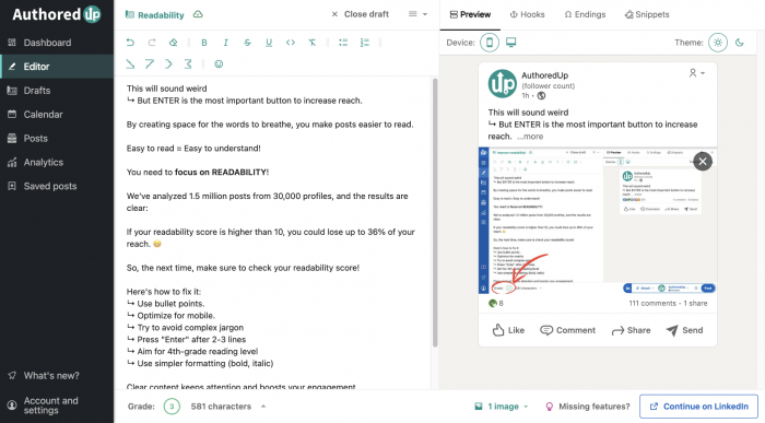
AuthoredUp approaches formatting as part of writing the post rather than as a separate font-generation step. Its free LinkedIn Text Formatter lets you write or paste a post, select specific text, apply formatting, reorganize content, and preview the result before moving it to LinkedIn. The formatter is free, requires no signup, and AuthoredUp says there is no limit on the number of posts you can format.
That makes it particularly useful when the problem is post structure, not simply producing one bold sentence.
What makes it useful
● Selective formatting keeps the post under control. You can highlight the part that needs emphasis instead of turning the entire draft into styled Unicode.
● Lists and spacing are treated as formatting too. Bold and italic are available, but bullet points, numbered lists, and line organization are more useful when a 1,000-character post needs clearer internal structure.
● The preview goes beyond plain text. AuthoredUp lets users see the post visually and can include an image in the preview, which is helpful because an opening line that feels restrained on a blank page can look much heavier once placed beside media.
One unusual feature is its ability to sort lines according to length, including staircase-like patterns. This is not necessary for every post, but it shows the difference between a LinkedIn-specific formatter and a generic font generator. The former thinks about how the entire post occupies the feed.
Where it works best
Imagine a post containing a short opening, three findings, and a final takeaway. AuthoredUp is useful because you can bold the opening, convert the findings into bullets, emphasize one phrase near the end, and inspect the complete composition rather than formatting each element separately.
What to watch out for
It offers more controls than someone who only wants to convert five words into bold text will need. Its broader product is also a LinkedIn content and analytics platform, so the free formatter sits inside a much larger creator ecosystem.
That is not necessarily a drawback, but users looking for a single input box and a copy button may prefer a simpler option.
Best for: People writing complete LinkedIn posts who care as much about structure and spacing as bold text.
2. Typegrow : Best for Previewing Structured Posts
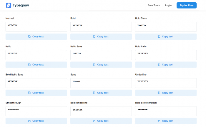
Typegrow's free formatter sits somewhere between a Unicode generator and a lightweight LinkedIn editor. You can enter a complete post, format either the entire text or selected portions, and view a LinkedIn-style preview beside it. The formatter is free and does not require registration.
Its style collection covers the usual bold and italic variants, but the more practical additions are numbered lists, bullet points and checklists.
What makes it useful
● The side-by-side post view encourages context-aware formatting. Instead of judging a bold phrase on its own, you can see how much visual weight it carries inside the finished post.
● It includes structural presets. Turning rough lines into a numbered list or checklist can improve scanability without introducing decorative characters everywhere.
● Partial formatting is supported. That is essential for LinkedIn because a single bold section label is usually more effective than a completely bold paragraph.
Typegrow also displays variations such as bold sans, serif bold, italic, bold italic, underline, strikethrough, script and double-struck text. There is enough variety for experimentation without forcing users to search different generators for different effects.
Where it works best
Typegrow makes sense for educational posts, processes, launch notes, or short lessons where the reader needs to distinguish between an introduction, several steps, and a takeaway.
For example:
𝗪𝗵𝗮𝘁 𝗰𝗵𝗮𝗻𝗴𝗲𝗱
• Customers wanted fewer options, not more.
• Setup time mattered more than feature depth.
• The simpler workflow produced better completion rates.
The bold line tells the reader where the section begins; the bullets do the real readability work.
What to watch out for
Many of the available Unicode styles are technically possible but not equally appropriate for LinkedIn. Script and decorative text can look interesting in the generator while adding little to a business or professional post.
Typegrow itself warns that formatted text can create search, device-compatibility, and screen-reader issues.
Best for: Writers who want a free post formatter with a strong combination of previewing and list structure.
3. Taplio : Best for Exploring More Styles Without Leaving a LinkedIn-Focused Tool
Taplio's LinkedIn formatter provides more than 20 visual variations, including serif and sans-serif bold, several italic combinations, underline, strikethrough, script, double-struck and fullwidth text. The formatter itself is available free and is designed to work on both desktop and mobile.
The useful part is that Taplio does not present formatting only as a font-selection exercise. It also displays text length information and encourages users to combine emphasis with bullets, symbols and whitespace.
What makes it useful
● There is enough style variety to compare subtle differences. Sans-serif bold often feels closer to the visual language of modern interface text, while serif bold creates a more obvious contrast.
● Formatting can be combined with structural symbols. A simple bullet or section marker often produces a clearer post than changing every heading into a different alphabet.
● The workflow remains straightforward. Write or paste text, select what should change, apply the style, inspect it, and copy the result.
Taplio is particularly useful for someone who wants more options than a basic bold generator but does not want to sift through hundreds of novelty alphabets.
Where it works best
Use it for posts that need one or two recurring visual conventions.
A creator might consistently use:
𝗞𝗲𝘆 𝗹𝗲𝘀𝘀𝗼𝗻
for section headings while leaving every explanation beneath them in ordinary text.
That repetition can create a recognizable structure across posts without turning typography into the subject of the post itself.
What to watch out for
Taplio's large selection makes over-formatting easy. Underline, script, fullwidth text and several bold variants might all be available, but availability is not an argument for using them together.
Taplio also explicitly cautions that decorative Unicode can cause problems for screen readers and may display differently across devices.
Best for: LinkedIn creators who want a larger style library while retaining a post-focused workflow.
4. YayText : Best for Quickly Comparing Unicode Variations
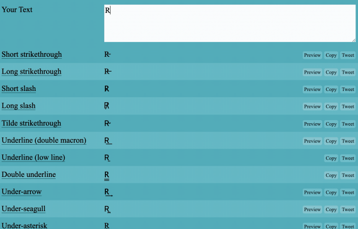
YayText is not built specifically for LinkedIn, and that is both its strength and its limitation. It is a general Unicode styling tool with separate generators for bold, italic, monospace, script, underline, double-struck, gothic, small caps, fullwidth text and many more unusual variations. Its public text generators can be used free in the browser.
For LinkedIn, the useful part of YayText is not the huge style catalogue. It is how quickly it lets you compare several versions of one short phrase.
What makes it useful
● Several variants are generated from one input. You can compare serif bold, sans-serif bold, serif italic and bold-italic without repeatedly changing settings.
● Copy buttons sit beside individual outputs. This works particularly well when you only need a formatted heading or a short phrase rather than a full-post editor.
● Its style library extends well beyond basic emphasis. That makes YayText useful for experimentation, even though many of those options are better left outside a professional LinkedIn post.
Where it works best
Suppose your opening line is:
Three things changed after we simplified onboarding
You can quickly compare whether serif bold or sans-serif bold gives the right amount of contrast before copying only that version into LinkedIn.
That is faster than formatting an entire draft when the only element you want to change is the hook.
What to watch out for
YayText is a Unicode generator first and a LinkedIn tool second. It does not understand the structure of your LinkedIn post in the way AuthoredUp or Typegrow does.
Its enormous style selection also contains plenty of options that are visually interesting but poorly suited to professional communication. YayText itself notes that these are Unicode characters rather than real font formatting and that their appearance can vary between platforms and devices.
Best for: Anyone who already knows which sentence needs emphasis and simply wants to compare several Unicode versions quickly.
5. LinkedInFormatter.org : Best for a Lightweight, Privacy-Focused Workflow
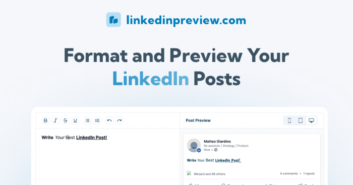
LinkedInFormatter.org is narrower than the creator suites in this list. Its main formatter provides bold, italic, bold italic, sans-serif variations, monospace, script, gothic, double-struck, small caps, fullwidth, underline, strikethrough and circled text alongside a LinkedIn-style preview.
The tool is free, requires no signup, has no stated usage limits, and says the formatting happens locally in the browser rather than sending entered text to its server.
What makes it useful
● Desktop and mobile previews are built into the formatter. This makes it easier to catch a heading that occupies too much space on a narrower feed.
● The tool includes LinkedIn-specific warnings beside the editor. Rather than pretending Unicode styling has no downside, it draws attention to search, character-count, and accessibility considerations.
● The interface stays focused on formatting. Users who do not need scheduling, analytics, AI writing, or a larger content suite can finish the job without entering another workflow.
The site also provides separate list formatting, text cleaning, small caps and character-counter utilities, which can be useful when a post needs structural cleanup rather than another decorative style.
Where it works best
It suits users who want to draft elsewhere and perform a final formatting pass immediately before publishing.
Write normally in your preferred editor, paste the final copy into the formatter, emphasize one or two elements, check the desktop and mobile views, then move the finished text to LinkedIn.
What to watch out for
The large style menu still contains options such as gothic, script and circled text that have limited professional use. A privacy-focused browser workflow does not remove the underlying accessibility limitations of the Unicode characters themselves.
Best for: Users who want an uncomplicated, no-account formatter with LinkedIn-style previews and browser-local processing.
6. Blabigo : Best When You Only Need the Essentials
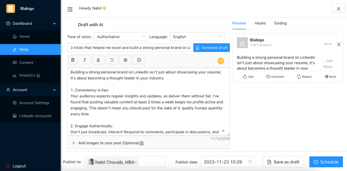
Blabigo's formatter is the simplest recommendation here. Rather than surrounding the user with dozens of visual alphabets, it focuses on core options including bold, italic, bold italic, underline, strikethrough and a code-like style. The formatter is free and does not require payment or signup to use.
That limited approach can actually be an advantage. A formatter used for professional posts does not necessarily become better when it generates 80 variations. Most LinkedIn users need only a reliable way to emphasize a heading, quote, statistic or takeaway.
What makes it useful
● The controls are immediately understandable. There is little time spent browsing decorative alternatives before reaching the styles that are actually useful.
● Selective formatting is easy. It works well when a finished post only needs one phrase bolded or one quote separated visually.
● The tool avoids turning formatting into a separate creative process. That makes it practical for users who regard styled text as finishing polish rather than part of content creation.
Where it works best
Blabigo fits short professional updates particularly well.
For example:
The result surprised us.
can become:
𝗧𝗵𝗲 𝗿𝗲𝘀𝘂𝗹𝘁 𝘀𝘂𝗿𝗽𝗿𝗶𝘀𝗲𝗱 𝘂𝘀.
The rest of the explanation can remain plain. Nothing more is needed.
What to watch out for
Its simplicity means you do not get the same post-composition experience as AuthoredUp or Typegrow. If you want mobile previews, detailed list controls, spacing assistance, or a wider collection of visual styles, another tool will be more useful.
Best for: People who want basic LinkedIn emphasis without a large style catalogue or content editor.
More Formatting Does Not Mean Better Formatting
All six tools can make a sentence more noticeable. The harder question is whether the change makes the post easier to understand.
For LinkedIn, formatting generally works best when each style has a job.
1. Bold creates hierarchy
Bold is most useful for section labels, an opening hook, an important figure, or a short takeaway.
For example: 𝗪𝗵𝗮𝘁 𝘁𝗵𝗲 𝗱𝗮𝘁𝗮 𝘀𝗵𝗼𝘄𝗲𝗱
Normal explanatory paragraph here.
The reader can locate the next section without every sentence competing for attention.
2. Italic creates lighter emphasis
Italic-looking Unicode produces less visual weight than bold. It can work for a short observation, quotation or aside, although plain quotation marks are often enough.
Using italic for an entire paragraph usually reduces rather than improves scanability.
3. Monospace should have a reason
Monospace can make a short metric, technical term or code-related phrase feel distinct:
𝙲𝚘𝚗𝚟𝚎𝚛𝚜𝚒𝚘𝚗: 𝟹.𝟾%
It becomes distracting when used simply because the option exists.
4. Decorative fonts rarely improve hierarchy
Script, gothic, bubble, fullwidth and double-struck text are visually distinctive, but distinction is different from readability.
If readers have to decipher the heading before they can process its meaning, the formatting has failed at its main job.
Where Formatting Helps Most
The best place for Unicode formatting is usually around the content rather than throughout it.
Consider using it in these situations:
● The opening line can receive a little extra weight. A short bold hook creates a clear starting point, particularly when the following text immediately returns to ordinary characters.
● Section labels can break up longer posts. Labels such as 𝗧𝗵𝗲 𝗽𝗿𝗼𝗯𝗹𝗲𝗺, 𝗪𝗵𝗮𝘁 𝗰𝗵𝗮𝗻𝗴𝗲𝗱, or 𝗧𝗵𝗲 𝗿𝗲𝘀𝘂𝗹𝘁 let scanners understand the shape of a post before reading every paragraph.
● One important statistic can be isolated visually. Formatting can help a result such as revenue growth, response rate, or time saved emerge from surrounding explanation, provided the number remains easy to interpret.
● A final takeaway can be separated from supporting detail. This is more useful than styling a generic call to action simply to make it louder.
● Profile sections can use restrained visual separators. A small amount of formatting can organize an About section, but important professional terminology is safer in ordinary text.
The common thread is selective use. Good hierarchy makes some elements quieter so another element can become prominent. LinkedIn ChatGPT prompts can also help turn rough ideas into stronger hooks and clearer post angles before formatting begins.
The Accessibility Trade-Off Is Real
Unicode styling solves a visual problem by creating a semantic one. W3C documentation warns that Mathematical Alphanumeric Symbols should not be used simply as styled prose because doing so can create problems for searching, restyling and accessibility processing.
Screen-reader support is not completely uniform. AuthoredUp notes that some newer assistive tools can interpret formatted Unicode correctly, while other screen readers still struggle with it. That means it is more accurate to describe Unicode formatting as inconsistently accessible rather than claiming that no screen reader can handle it.
A practical rule is therefore simple:
Never hide the meaning of the post inside the styling.
This is safer:
𝗞𝗲𝘆 𝗹𝗲𝘀𝘀𝗼𝗻
Customers abandoned the process when registration required more than three steps. The important information remains ordinary text even if the decorative heading is interpreted poorly.
Keep Searchable Information Plain
The same technical distinction matters for search and text processing. A normal A and a mathematical bold 𝐀 may look closely related to a human reader, but they are different Unicode characters. W3C specifically identifies searching as one of the areas where using mathematical alphanumeric characters as styled prose can cause problems.
For that reason, avoid unnecessary Unicode styling around information that you actively want systems to recognize:
● Your name and professional title
● Core skills and specialties
● Company or product names
● Important industry keywords
● Location information
● Search-oriented profile terminology
● Hashtags and URLs
Typegrow similarly warns that formatted text may not be searchable on LinkedIn.
The visual benefit of making 𝗣𝗿𝗼𝗱𝘂𝗰𝘁 𝗠𝗮𝗿𝗸𝗲𝘁𝗲𝗿 look bolder in a profile headline is rarely worth weakening the machine-readable version of a term someone might actually search for. A LinkedIn bio that wins clients also depends on keeping important role, audience, and outcome terms clear and searchable.
Which LinkedIn Formatter Should You Pick?
There is no reason to choose according to font count alone.
| If Your Priority Is | Best Fit |
| Formatting and structuring an entire post | AuthoredUp |
| Combining text styles with lists and previewing | Typegrow |
| Exploring a broader range of LinkedIn-oriented styles | Taplio |
| Quickly generating several versions of a short phrase | YayText |
| Using a lightweight, browser-local formatter | LinkedInFormatter.org |
| Applying only basic emphasis without extra tools | Blabigo |
For most people writing full posts, AuthoredUp and Typegrow are the more practical choices because they treat formatting as part of post structure. If you only want to turn a five-word heading into bold text, YayText or Blabigo can accomplish the same job with less interface around it.
Final Verdict
The best LinkedIn text formatter is not the one capable of producing the strangest alphabet. For professional posts, bold, italic, bullets, spacing and a useful preview matter far more than a catalogue of decorative fonts.
AuthoredUp offers the strongest all-around experience for composing and formatting complete posts, while Typegrow is a close alternative for writers who want structured lists and a LinkedIn-style preview. Taplio is better suited to people who want more visual options, and YayText remains one of the easiest ways to compare Unicode variants quickly.
The larger lesson is more important than the ranking. Formatting should reveal the structure already present in good writing. It cannot create structure when the writing itself has none. A bold heading works because the paragraph beneath it has a clear purpose. A bullet list works because the ideas belong together. Once every line is emphasized, nothing is emphasized anymore.
Comments