

Most carousels fail for the same reason. They look finished but were never built to be swiped. The slides are polished, the colours are nice, and the post still stalls at a handful of likes because nothing in it gives the reader a reason to move to the next slide.
This guide covers the full build, from the signals Instagram actually reads, through each slide, down to the numbers that tell you what to fix. There is no filler and no "what is a carousel" section. If you post carousels and want them to do real work, this is the method that moves the metrics that matter.
What Actually Counts as Engagement
Likes are the signal everyone chases and the one that matters least. The feed rewards deeper actions, and a carousel is built to generate them, because every swipe, every extra second of attention, and every save feeds the ranking system far more than a tap of the heart.
There is also a mechanic most people miss. Instagram head Adam Mosseri has confirmed that when someone scrolls past a carousel without engaging, the feed resurfaces it later showing a different slide, giving the post a second chance at attention. A static image never gets that. This is why a well-built carousel keeps earning reach for days, not minutes.
Here is how the five signals rank in practice, from weakest to strongest:
● Likes: cheap and passive, with little effect on reach by themselves.
● Comments: a real signal, but harder to earn without a genuine reason to reply.
● Swipe-through (dwell time): every slide someone clears adds watch time, which the algorithm treats as proof of value.
● Shares: someone putting your post in front of their own network is a strong vote.
● Saves: the strongest of all. A save says "I want this later," which is exactly what Instagram works to surface.
The whole game is moving people from the weak signals to the strong ones, and the carousel is the only format that lets you engineer that slide by slide.
One Idea Per Carousel
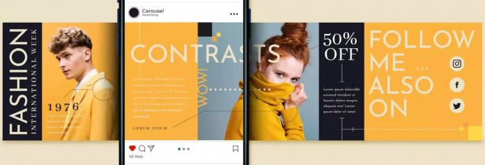
The instinct is to cram value in, with "10 tips" or "everything you need to know." It backfires. When a carousel tries to cover five things, each slide turns shallow, the reader senses there is no single payoff, and they drop out before the end.
A tight single idea does the opposite. It sets a clear promise on slide one, pays it off across the middle, and gives the reader a reason to save, because one well-explained thing is worth keeping and a scattered list is not. Choosing from clear Instagram content pillars also helps keep each carousel focused. Tutorials, frameworks, and checklists built around one topic consistently earn the most saves for this reason.
Write the carousel's point in a single sentence before building anything. If that sentence will not hold the whole post, the idea is two or three carousels pretending to be one.
Make the First Slide Stop the Scroll
The first slide does two jobs at once. It is the cover that appears in the feed, and it is the hook that earns the swipe. If it fails, nothing behind it matters. Analyses place as much as 80% of a carousel's performance on this one slide.
A hook is not a title card. "5 Instagram Tips" sitting over a logo is a cover, and it does nothing. A hook opens a gap between what the reader knows and what they want to know, and that gap closes only by swiping. Specificity, a bold claim, or a small bit of tension all work. A vague headline does not.
| Not this (cover) | This (hook) |
| "Tips for better reach" | "Your reach is dying on slide 2. Here's why." |
| "My morning routine" | "The 6am habit I quit that doubled my output" |
| Logo + title centred | One sharp line, big text, instant tension |
Keep the promise legible at thumbnail size. If a reader cannot read it while scrolling fast, the swipe never gets a chance to happen.
Earn the Second Swipe
Slide two is the most underrated slide in the format. Clearing it is the moment a casual viewer becomes a committed reader, and people who get past slide two tend to reach the end. That makes it a gateway, not filler.
Do not treat it as support for slide one. It has to carry its own weight: pay off the hook quickly, then widen it. If slide one promises a reason, slide two starts delivering it rather than restating the headline in smaller type. One account tested a contradictory statement on slide two and saw a 60% lift in people swiping all the way through, because the tension from slide one got sharper instead of softer.
Use a simple test: read slide two on its own. If it makes sense and still pulls you forward with no memory of slide one, it is doing its job.
One Thought Per Slide
Crowded slides get swiped past, not read. When a slide holds a paragraph, three sub-points, and an icon, the eye bounces and the reader keeps moving. The fix is almost mechanical: one claim per slide, one visual focus, and nothing competing for attention.
This is information architecture, not decoration. Each slide should read in a second or two. When a point needs more room, split it across two slides rather than shrinking the font. More slides also means more swipes, which means more dwell time working in your favour.
Aim for a clear rhythm. The reader finishes a slide, takes one clean point from it, and swipes for the next one.
Leave Them Wanting the Next Slide
Getting the first swipe is a hook problem. Getting every swipe after it is a pacing problem, and this is where most carousels fall apart. The strongest ones treat the whole post as a chain of small hooks, where each slide ends in a way that makes the next one feel necessary.
The technique is the open loop. End a slide mid-thought, on a question, or on a "but here's the catch" beat, so the reader has to swipe to close it. It works the same way a series ending pulls you into one more episode. A slide that resolves completely gives the reader permission to leave. A slide that leaves a thread open carries them on.
This does not belong on every slide, and overusing it reads as a trick. One or two open loops in the middle, where drop-off is highest, carry people to the end.
Design for Saves or for Shares
Saves and shares are both strong signals, but they come from different kinds of content, and chasing both in one post tends to deliver neither. Decide up front which one the carousel is built for.
Saves reward reference value. People save what they want to use later: a framework, a checklist, a step-by-step they cannot hold in one pass. For saves, design the carousel so the final slide is worth returning to, and make that obvious.
Shares reward identity and emotion. People share what says something about them: a take they agree with, a feeling they recognise, a "this is so me" moment. For shares, the content has to be something the reader is glad to be seen endorsing.
| Built for saves | Built for shares | |
| Content type | Frameworks, checklists, how-to | Opinions, relatable truths, hot takes |
| Reader thought | "I'll need this later" | "This is so me / so true" |
| Last slide job | Recap worth keeping | A line worth quoting |
Keep It Readable on a Phone
Almost no one sees a carousel on a desktop. It lives on a phone, in a fast-moving feed, often with one thumb hovering to scroll on. Design for that reality or lose people to friction that never shows up on your own screen.
A few non-negotiables:
● Vertical 4:5 (1080 x 1350 px). It takes the most screen space in the feed, which means more room for the message and more reason to stop.
● Large, high-contrast text. If it needs zooming, it is already too small. Thin lines and tiny icons disappear on a phone screen.
● Safe margins. Keep key text and elements away from the edges and corners, where the slide counter, captions, and the reader's thumb cover the slide.
● Test on an actual phone before posting. A layout that looks balanced on a laptop often reads cramped or off-centre on the device people actually use.
Keep a Consistent Look
When your carousels share a visual system, the same layout grid, colours, and type treatment, people recognise your posts before they read the handle. That recognition compounds. Each post builds on the last instead of starting from zero.
Consistency also helps the swipe. When every slide feels like a step in the same story rather than a separate poster, moving forward feels natural. A reusable template is not about looking corporate. It removes the small visual jolt that makes a reader pause and decide whether to continue.
Build one grid and reuse it, with a fixed spot for the headline, the body, and the slide number. Vary the content inside it, not the frame around it.
Make the Last Slide Do One Job
The last slide is a decision point, and "Follow for more" wastes it. By the time someone reaches the end, they have given you real attention. That is the moment to ask for one specific action, not a generic sign-off that reads as background noise.
Pick one job for it: prompt a save ("Keep this for your next post"), invite a comment with a real question people want to answer, loop back to the promise from slide one so the post feels complete, or point to a clear next step. One ask, stated plainly, beats three competing ones.
For comments, skip "comment below." Ask something specific and easy: a this-or-that, a "which one are you," a single honest question. The easier it is to answer, the more replies it earns, and comments are a signal likes will never match.
Write the Caption to Support the Slides
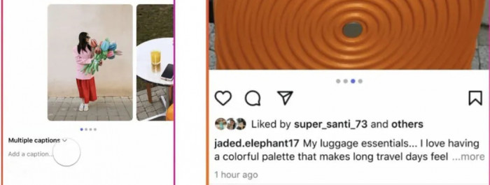
The caption is not an afterthought stapled to the post. It carries context the slides cannot hold, it is where comments get seeded, and it does your search and keyword work. Knowing how to write Instagram captions that get engagement helps turn that attention into meaningful interactions. Treating captions as throwaway lines leaves real engagement on the table.
A strong caption does three things:
● Opens with a hook of its own. Only the first line or two shows before "more," so the caption has to earn the expand the same way slide one earns the swipe.
● Adds what the slides left out. Context, a short story, the nuance that did not fit on a clean slide. This is where depth lives.
● Ends with a real reason to comment. A genuine question beats "thoughts?". Give people something specific and low-effort to respond to.
Keywords belong here too. Instagram reads caption text for search, so naming the topic in plain language, not just hashtags, helps the right people find the post later.
Post at the Right Time and Watch the First Hour
A carousel's early engagement shapes how far it travels. When the first wave of your audience swipes, saves, and comments quickly, the feed reads a strong post and widens its reach. A slow first hour tells it the opposite.
Timing matters, but not the way people obsess over it. The goal is to post when your specific audience is active, not to chase a universal "best time" that ignores your followers. Check your own insights for when your people show up, and post into that window.
Consistency beats frequency. Three solid carousels a week, every week, trains both the audience and the algorithm better than a burst of ten followed by silence. And because carousels get re-served over days, the first hour is the start of the story, not the whole of it. A post keeps climbing well after you have moved on.
Read the Numbers That Tell You What to Fix
Vanity metrics make you feel good. Diagnostic metrics make you better. The point of reading numbers is not to admire the likes but to find the exact slide or choice that cost you reach, so the next carousel fixes it.
These are the ones worth reading, and what each one points to:
| Metric | What it tells you | What to fix if it's low |
| Swipe-through rate | How far people got | The hook (slide 1) or the slide where they dropped |
| Save rate | Whether it was worth keeping | The core value, make it more useful or reference-worthy |
| Share rate | Whether it was worth passing on | The take, make it more relatable or quotable |
| Reach ratio | How far it spread vs your base | The whole package, signals were not strong enough |
As a benchmark, a swipe-through rate above 50% and a save rate in the 5 to 10% range mark a carousel that is working. Track where in the carousel people fall off. A big drop at slide four means slide four is not earning the next swipe, and that tells you exactly what to rebuild.
Every weak number maps back to a specific slide. That is the real advantage of the format. It tells you where it broke.
The Verdict
A carousel is not a stack of pretty slides. It is a sequence engineered for one outcome. The hook earns the swipe, slide two earns the commitment, the middle holds attention with open loops, and the last slide asks for the one action you want. Every slide has a job, and the posts that win are the ones where every slide does it.
Engagement is not something you add at the end with a clever caption or a trending audio. It is built into the structure from slide one. Pick a single idea, decide whether the goal is saves or shares, and design every slide to move the reader to the next.
Apply this to the next post. Write the one-sentence point, sharpen the first slide until it stops a scroll, and read the swipe-through number afterwards. Building to be swiped and then fixing what the numbers expose will do more for engagement than any template.
Comments