

Most of the time spent on a chart is not spent charting. Here is how to cut the prep, the fiddling, and the rework.
Why charts take longer than they should
Ask anyone who builds decks where the time goes and the answer is rarely "drawing the chart." The chart itself takes a minute. The other twenty go to cleaning a column of numbers stored as text, deleting a totals row that broke the axis, resizing labels that overlapped, recolouring six series so they match the slide template, and then doing it all again when the numbers change on Thursday.
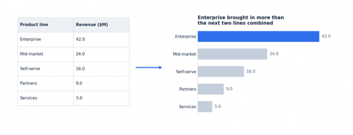
The delay comes from three places:
• Data that is not chart-ready. Merged headers, mixed date formats, subtotal rows, and blank cells all need fixing before any tool will draw something sensible.
• Decisions made one at a time. Chart type, sort order, colours, axis range, and title are each a small decision. Made individually, in a dialog box, they add up.
• Rework. A chart pasted as a screenshot looks soft on a projector. A chart built for one slide does not match the one on the next. Both get rebuilt.
Speed comes from removing decisions and rework, not from clicking faster. The rest of this guide covers how.
Prepare the spreadsheet before you chart
A few minutes of preparation saves more time than any tool. Whatever you use to draw the chart, aim for a range that looks like this:
• One header row, no merged cells, one label per column.
• One row per category or time period. No subtotal or grand total rows mixed in.
• Numbers stored as numbers, not text. Currency symbols and thousands separators in the cell format, not in the value.
• Dates in one consistent format, ideally ISO (2026-09-14) so nothing gets misread.
• No blank rows or columns inside the range.
If the source sheet is messy and you cannot change it, build a small "chart range" on a separate tab that references the source with formulas. That range stays clean even when the raw data does not, and it updates automatically when the source changes.
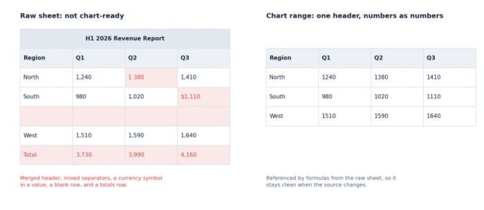
Left: the raw sheet with the problems highlighted. Right: a separate chart range that references it with formulas.
Also decide the finding before you build. "Revenue by quarter" is a variable name. "Q4 was the strongest quarter of the year" is a finding. Knowing the finding tells you which chart to pick and what to highlight, and it becomes the title.
Match the chart type to the shape of the data
Chart type is the decision that most often gets revisited later, so make it once and make it well. The shape of your data usually settles it:
| Data shape | Use this chart | Avoid this chart |
| A few categories, one value each | Bar chart, sorted by value unless the order carries meaning | Pie chart with more than five slices |
| Change over time | Line chart, or area chart when volume matters | Bar chart with dozens of narrow bars |
| Parts of one total | Donut or pie with five slices or fewer, or a stacked bar | Multiple pies side by side |
| Two or three series across categories | Grouped bar chart | Dual-axis chart with mismatched scales |
| Relationship between two measures | Scatter plot | Line chart joining unrelated points |
| Long category names or rankings | Horizontal bar chart | Vertical bars with rotated labels |
Table 1. Chart type by data shape.
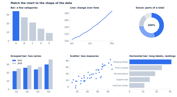
The six shapes from Table 1, drawn with the same palette. One highlighted series, the rest in grey.
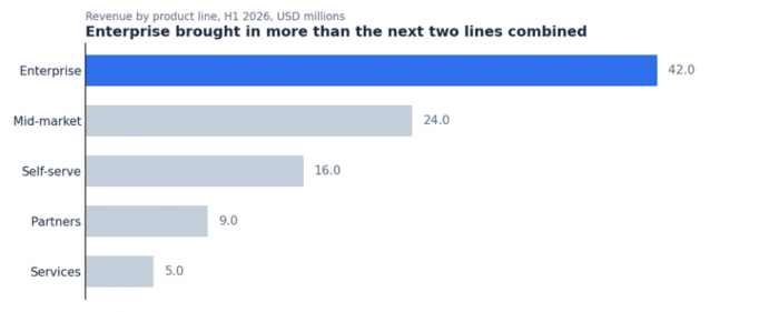
A presentation-ready bar chart: sorted, one series highlighted, values labelled, zero baseline, and a title that states the finding.
Three ways to build the chart
Once the data is clean and the chart type is chosen, there are three practical routes to a finished chart. Each suits a different situation.
1. Build it in the spreadsheet
Excel and Google Sheets both draw charts directly from a range. This works well when the chart lives inside the spreadsheet or when a colleague needs to edit the source later. The cost is formatting: default charts need manual work on colours, gridlines, fonts, and labels before they look like they belong in a deck, and that work repeats on every chart.
2. Build it from a template
If you produce the same charts every month, a template saves real time. Set up a chart once in your slide tool or spreadsheet, format it properly, and paste new data into the linked range each period. Templates are fast for recurring reports but brittle: a new category, a longer date range, or a different chart type usually means rebuilding.
3. Describe it and let a tool draw it
The third route is to paste the range into a dedicated chart tool that reads the data, applies sensible defaults, and draws a finished chart with far less manual formatting than a spreadsheet. Some of these tools work from templates you configure, others from a plain-language description. This route suits one-off charts, mixed sources, and deadline situations where you need eleven charts to look like one deck without formatting each one. The next section covers three tools that take this approach.
Three tools that speed up the spreadsheet-to-chart step
Each of these tools accepts pasted spreadsheet data or a CSV and produces a chart that needs little or no formatting afterward. They differ in how much control they give you, how they export, and how much setup each chart needs.
1. Datawrapper
Datawrapper is a browser-based tool built for newsrooms and reporting teams. You paste data from a spreadsheet, upload a CSV, or link a Google Sheet, then move through a fixed four-step editor: check data, choose visualisation, refine, publish. It offers around 20 chart types alongside tables and maps, with annotations, highlighted values, and labels that avoid overlapping.
• Strengths: Clean, consistent output; responsive charts that adapt to screen size; live updates when linked to a Google Sheet; text annotations and shaded ranges for explaining a finding.
• Limits: PNG export is free, but SVG and PDF export require a paid plan, which matters for projected slides. Free-plan charts carry a "Created with Datawrapper" attribution. The step-by-step editor is thorough but adds time when you only need a quick chart.
• Best for: Charts that will be embedded on a website or in a report and updated over time.
2. Flourish
Flourish is a template-driven visualisation tool, now part of Canva. You upload a spreadsheet or CSV, pick from more than 50 templates, and adjust settings in a side panel. Its distinguishing feature is interactivity and animation: bar chart races, scrollytelling stories, and animated transitions between chart types. Flourish can also suggest a chart type from your dataset.
• Strengths: Wide template range covering charts, maps, and interactive stories; direct insertion into Canva presentations; a free plan that includes all template types for unpublished work.
• Limits: Image and SVG downloads are part of the paid Presenter plan. The number of settings per template can be overwhelming when you only need a bar chart. Interactive output is less useful for a static deck than for the web.
• Best for: Presentations built in Canva and any chart where animation or interactivity adds to the story.
3. ChartGPT
ChartGPT is a browser-based chart maker that turns pasted spreadsheet data or a plain-language description into a presentation-ready chart. It supports nine chart types: bar, horizontal bar, grouped bar, stacked bar, line, area, pie, donut, and scatter. Charts export as PNG, SVG, or PDF on every plan, and the underlying chart specification can be copied as JSON. No account is required to make and export a chart.
Unlike the two tools above, there is no editor to work through. The workflow has three steps:
1. Give it the numbers. Copy a range from Excel or Google Sheets and paste it in, upload a CSV, or write the values into a sentence. Column headers become axis labels and series names. Up to 500 rows can be pasted at once.
2. Say what you want to show. Name a chart type if you have one in mind. If you do not, the tool picks one based on the shape of the data: time series get a line, categories get bars, shares of a total get a donut. If you also state what the chart is for, the title is written as a finding rather than a variable name.
3. Adjust and export. Switching chart type redraws instantly. Title, sort order, units, and which values are included are changed by editing the prompt and generating again. Then export as PNG for a quick paste, SVG for slides that will be projected, or PDF for print.
A few design rules are built in and remove decisions you would otherwise make by hand:
• Bars always start at zero. If you need a close-up of a narrow range, the tool gives you a line chart with a labelled axis instead.
• One series, one colour. When you want to point at a single bar, the rest go grey.
• Messy paste is handled. Merged headers, a stray totals row, numbers stored as text, and mixed date formats are read as they are rather than rejected.
• It asks when unsure. If a column could be March or April, or a total does not add up, the tool flags it instead of quietly guessing.
• Consistent output. The language model reads the prompt and produces a chart specification, but the drawing is done by the tool's own rendering code, so charts look the same from one to the next.
Two limits are worth stating plainly. Colours and axis range are chosen automatically and cannot be overridden at present. And nothing is stored: the chart lives in the browser tab until you export it, and there is no chart history on any plan. Export before you close the tab.
• Best for: Static charts headed for a slide deck, especially many charts from mixed sources under time pressure.
| Aspect | Datawrapper | Flourish | ChartGPT |
| How you build | Four-step editor | Template plus settings panel | Paste data and describe the chart |
| Chart types | Around 20, plus tables and maps | 50+ templates, including interactive and animated | 9 static types |
| SVG export | Paid plans | Presenter plan | All plans, no account needed |
| Manual control | High | High | Low; colours and axis range are automatic |
| Time per chart | Minutes | Minutes | Seconds |
Table 2. The three tools at a glance.
Manual charting vs Datawrapper, Flourish, and ChartGPT
The table below sets out where the time goes in each approach. "Manual" means building a chart in Excel or Google Sheets and formatting it for a slide by hand.
| Step | Manual (Excel or Sheets) | Datawrapper | Flourish | ChartGPT |
| Data preparation | Clean the range by hand: remove totals, fix text-stored numbers, unify dates | Paste or link a sheet; a data check step flags column types before charting | Upload or paste; columns are mapped to the template by hand in a side panel | Paste as-is; common problems are handled, ambiguous ones are flagged |
| Chart type selection | Pick from a gallery; defaults often do not fit the data shape | Choose from around 20 types plus tables and maps | Choose from 50+ templates, or let it suggest one from the data | Name a type or let it pick from the data shape; switch instantly afterward |
| Formatting | Adjust colours, gridlines, fonts, labels, and axis range per chart | Clean defaults with full control over colours, annotations, and labels | Template defaults with many per-template settings to tune | Applied automatically with one palette; not individually adjustable |
| Title | Typed manually, usually as a variable name | Typed manually, with a description field and notes | Typed manually in the template settings | Written as the finding when you state what the chart is for |
| Consistency across a deck | Depends on repeating the same manual steps on every chart | Good if you reuse a saved theme; custom themes are on paid plans | Good if you reuse one template and its settings | Built in; charts from different sources share one look |
| Editing later | Full control over every element inside the spreadsheet | Charts are saved to your account and can be reopened and updated | Projects are saved to your account and can be reopened and updated | Edit the prompt and regenerate; no saved history, so keep the source data |
| Export | Copy and paste as an image, or embed a linked chart object | PNG on the free plan; SVG and PDF on paid plans; web embed | Image and SVG on the Presenter plan; web embed; direct insert into Canva | PNG, SVG, PDF, or JSON specification on every plan |
| Time per chart | Ten to twenty minutes including formatting | A few minutes | A few minutes | Under a minute |
| Best for | Charts that live in the workbook and need granular control | Charts embedded on a website or in a report and updated over time | Canva presentations and charts where animation or interactivity helps | Static slide charts, especially many charts under time pressure |
Table 3. Where time is spent in each approach.
None of the four wins in every case. Manual charting is the right choice when you need fine control or when the chart must stay linked to a live workbook. Datawrapper and Flourish sit in the middle: less formatting than a spreadsheet, more control than a describe-it tool, and the ability to reopen and update saved charts. ChartGPT is the fastest of the group but gives up manual control in exchange.
Export formats compared
Choosing the wrong export format is the most common cause of a chart that looked fine on a laptop and looked soft on a projector. The format should match the destination.
| Format | How it scales | Best use | Watch out for |
| PNG | Fixed pixels; blurs when enlarged beyond its native size | Quick pastes into email, chat, documents, and social posts | Export at 2x resolution if it may be enlarged or screenshotted |
| SVG | Vector; stays sharp at any size | Slides that will be projected or shown on large screens | Some older tools rasterise SVG on import; check the result once |
| Vector; stays sharp in print | Printed reports and board packs | Less convenient for pasting into slide software | |
| JSON specification | Not an image; describes the chart's data and settings | Rebuilding the chart in another tool or automating it via an API | Requires a tool that can read the specification |
Table 4. Export formats by destination.
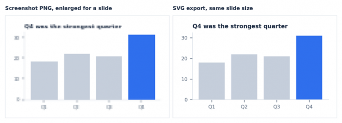
A screenshot enlarged to slide width against an SVG at the same width. The difference is obvious on a projector.
The short rule: SVG for slides, PNG for anything that will be pasted quickly, PDF for print.
A repeatable workflow for recurring decks
Board packs, investor updates, and monthly metrics emails share a problem: the numbers change every month but the charts should not need rebuilding every month. A workflow that holds up over time looks like this:
1. Keep a clean chart range in the source workbook. One tab, one range per chart, populated by formulas from the raw data. This is the single thing that makes every later step faster.
2. Write the finding, not the variable. Decide what each chart is meant to say before you build it. Store this next to the range so the title is ready each month.
3. Build each chart the same way every time. If you paste the range into ChartGPT, save the prompt you used alongside the range. Next month, paste the new numbers, reuse the prompt, export the SVG, and drop it into the slide. The chart looks the same as last month's because the tool draws it the same way.
4. Export in the right format on the first pass. SVG for the deck, PNG for the email summary. Do not export a PNG and hope it scales.
5. Keep the source, not the chart. Store the range and the prompt. Charts can be regenerated in seconds; clean source data cannot.
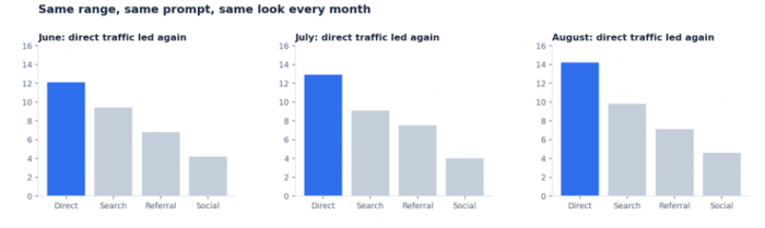
Three months of the same chart from the same range and prompt. Nothing was reformatted between them.(generated by chartgpt.co)
Mistakes that slow you down
• Charting the raw sheet. Subtotal rows and merged headers turn into wrong bars and broken axes. Chart a clean range.
• Truncating the bar axis. Starting bars above zero exaggerates differences and gets challenged in the room. Use a line chart for close-ups.
• Using colour as decoration. Six categories in six colours tells the audience nothing. Highlight one series and grey the rest.
• Titling with the variable name. "Revenue by region" makes the audience do the work. State the finding.
• Screenshotting charts into slides. Screenshots are low-resolution PNGs. Export SVG.
• Rebuilding from scratch each period. If you make the same chart monthly, the process should be paste, regenerate, export, done.
Conclusion
Making charts faster is mostly a matter of removing the work that surrounds the chart: cleaning data once instead of every time, choosing the chart type from the shape of the data, letting sensible defaults handle formatting, and exporting in the format the destination needs. Do that and the chart itself takes the twenty seconds it always should have.
Datawrapper and Flourish both cut formatting time while keeping fine control, and suit charts that will be embedded or updated on the web. For charts headed into a deck, ChartGPT removes most of the remaining decisions: paste the range, say what the chart is for, export the SVG. For charts that need to live inside a workbook with full control, the spreadsheet's own charting is still the right tool. Knowing which situation you are in is the last piece of getting faster.
Comments