

There's a quiet irony on TikTok right now. Creators spend hours color-grading footage and stitching cuts, then watch a static set of images with three lines of text pull twice the reach. Slideshows look like the least effort in the room, and that's exactly the point people miss. The format isn't winning despite being simple. It's winning because simplicity forces you to do the one thing video lets you avoid: make every beat earn its place. This piece breaks down how the slideshow actually works under the hood, and how to turn an ordinary idea into something people finger-swipe all the way to the end.
What a TikTok Slideshow Actually Is
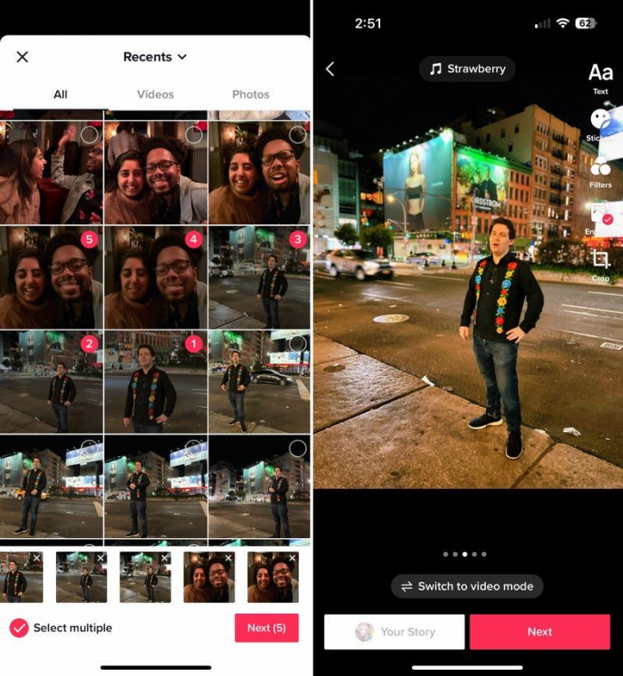
A TikTok slideshow, the feature lives inside Photo Mode is a post made of still images that plays back inside the same For You feed as video. The images auto-advance on a timer, loop when they reach the end, and let the viewer swipe forward or back at their own pace. That last detail is the whole game. The viewer is holding the remote.
People constantly lump this in with the Instagram carousel, and the two share a surface resemblance, but they behave differently in the ways that matter. Understanding the split is what separates someone repurposing content blindly from someone who tailors it:
| Trait | TikTok Slideshow | Instagram Carousel | Short Video |
| Advance behavior | Auto-plays and loops; viewer can swipe manually | Fully manual; no auto-advance | Plays on a fixed timeline |
| Audio | Full trending-sound library | Music mostly on Reels, not static carousels | Central to the format |
| Ranking pool | Competes in the same feed as video | Separate feed logic | The default TikTok surface |
| Pace control | Shared system and viewer both drive it | Entirely the viewer's | Entirely the creator's |
| Production cost | Low; a phone and a caption | Low to medium | Medium to high |
The takeaway: a slideshow is a video-adjacent format wearing a carousel's clothes. It gets ranked like video, sounds like video, but reads like a magazine you flip through. Treat it as a straight carousel and you'll leave most of its advantages on the table.
Why the Swipe Changes Everything
Passive video watching and active swiping feel similar to a viewer, but they send very different signals and trigger very different psychology. When someone swipes, they've made a tiny decision: show me the next thing. That decision is the format's engine.
A few mechanics stack on top of each other here, and each one is worth pulling apart on its own:
● The swipe creates an open loop. Every slide that ends mid-thought leaves a small itch the brain wants scratched. A cliffhanger in a video plays whether you like it or not; a cliffhanger in a slideshow makes you reach out and resolve it. That physical act deepens investment in a way autoplay can't replicate.
● Re-reading inflates dwell time honestly. Because slideshows loop and people read at different speeds, a viewer who lingers on a slide or swipes back to re-read a line is quietly logging watch time. You're not gaming the metric the format naturally produces the exact behavior the algorithm rewards.
● Self-paced consumption lowers the exit rate. A video that moves too fast loses the slow reader; one that moves too slow loses the impatient one. A slideshow sidesteps the tradeoff entirely, because each person sets their own speed. Fewer people bail out of frustration.
● The manual swipe is a micro-commitment. Each forward swipe is a fresh yes. String five of them together and the viewer has actively chosen to stay four separate times is a much stronger engagement footprint than one uninterrupted watch.
If a video is a train the viewer boards, a slideshow is a staircase they climb one step at a time. Your job is to make each step feel worth taking.
The Anatomy of a Scroll-Stopping First Slide
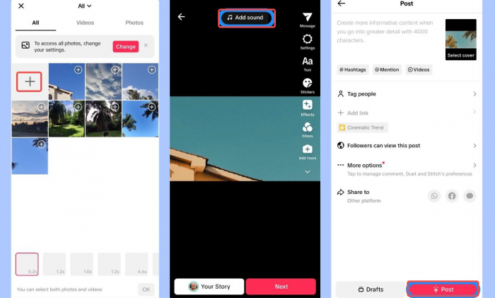
The first slide does three jobs at once, and most people only ask it to do one. It's the thumbnail that appears on your profile grid. It's the hook that stops the scroll. And it's a promise about what the next slides will pay off. Get the first slide wrong and nothing after it matters, because nothing after it gets seen.
A strong opener usually does one of a handful of things well: it names a specific tension the viewer recognizes, makes a claim bold enough to demand proof, poses a question the reader cannot answer on their own, or teases a payoff without giving it away. If the opening still feels flat, exploring a few different hook ideas can help reveal different ways to create that forward pull without relying on clickbait. What the first slide should almost never do is simply describe what the viewer is already looking at.
One practical rule: the first slide should be readable in under a second and legible as a thumbnail the size of a fingernail. If your hook needs two sentences to land, it's not a hook yet.
Turning a Simple Idea Into a Story Arc
Here's where the title of this whole thing earns its keep. Most "simple ideas" are really just a single fact sitting on a table. "Drink more water." "I renovated my kitchen." "This app saves me time." Flat. The craft is finding the arc hiding inside that fact and stretching it across slides so there's somewhere to travel.
An arc doesn't need to be dramatic. It needs a shape: a starting point, some friction in the middle, and a resolution that feels earned. Take a dull idea and run it through that shape:
● Start with the state before. Where things stood, what was frustrating, what the reader might recognize in their own life. This is the slide that makes someone think "that's me."
● Introduce the turn. The moment something shifted a realization, a mistake, a discovery. This is the middle slide most people skip, and skipping it is why so many slideshows feel like a list instead of a story.
● Deliver the after, then the meaning. Show the result, but don't stop there. The final slide should leave a thought behind, not just a conclusion. A story people remember ends on a takeaway they can carry, not a full stop.
"Drink more water" becomes: the afternoon crashes you blamed on your job (before), the week you tracked your intake and found the real culprit (turn), what changed and the smaller habit that made it stick (after and meaning). Same idea. Now it's a journey.
Content Frameworks That Reliably Work as Slideshows
You don't need to reinvent structure every time. A handful of shapes carry the format well because each one has a built-in reason to keep swiping. Match your idea to the framework that already fits it instead of forcing every idea into the same mold.
| Framework | Best for | What pulls the next swipe |
| Listicle ("7 things…") | Tips, tools, quick value | The count people want to reach the end of a numbered set |
| Before / After | Transformations, results, glow-ups | The gap between the two states begs to be closed |
| Myth-busting | Correcting a common belief | The tension of being told you're wrong about something |
| Step-by-step | Recipes, tutorials, processes | Sequence you can't skip ahead without missing a step |
| Storytime | Personal narrative, drama, lessons | The open loop of "what happened next" |
| "Things I wish I knew" | Hard-won advice, hindsight | Fear of missing the one insight that matters |
Notice the pattern in that last column: every framework that works has a mechanical reason the viewer keeps going. If you can't articulate why someone would swipe from slide two to slide three, the framework isn't doing its job yet.
Writing Text That Earns the Next Swipe
The words on a slideshow do more work per character than almost anywhere else on the platform. You have a few lines and a single held moment. That's it. Two habits will lift your text above the average almost immediately.
1. First, one idea per slide. The instinct is to cram, because you're afraid of running long. Resist it. A slide that holds a single thought is easier to absorb, easier to re-read, and leaves room for the line that matters most to breathe. Crowded slides are the fastest way to make someone swipe away instead of forward.
2. Second, write the bottom line as a hook for the top of the next slide. The last thing a reader sees before they swipe should tilt them forward. End a slide on "and that's when it fell apart" and the next swipe is nearly automatic. End it on a tidy summary and you've given them a natural place to leave. Every slide's final line is a door leave it slightly open.
A small thing that reads as very human: vary your slide lengths. A punchy three-word slide dropped between two denser ones creates rhythm, and rhythm is what keeps a reader in flow. Uniform slides feel like a spreadsheet.
Visual and Design Principles Without Being a Designer
You don't need a design background to make a slideshow look intentional. You need consistency and legibility, and those are decisions, not talents.
● Pick a look and hold it across every slide. Same font, same text position, same color treatment. Consistency signals "this is one piece" and makes the set feel considered rather than thrown together. A viewer clocks visual coherence before they read a single word.
● Respect the safe zone. TikTok's interface caption, username, buttons eats into the bottom and right edges of the screen. Keep your text away from those corners or the platform will crop your best line behind a share button.
● Contrast is non-negotiable. Light text on a busy photo disappears. Drop a subtle shadow, a dark gradient, or a semi-transparent band behind your words. If you have to squint on your own phone, so will everyone else.
● Let the image carry emotion the text can't. The photo isn't wallpaper. A slightly imperfect, real-looking image often outperforms a polished stock shot because it feels like a person, not a brand.
The Role of Sound : Yes, Slideshows Have Audio
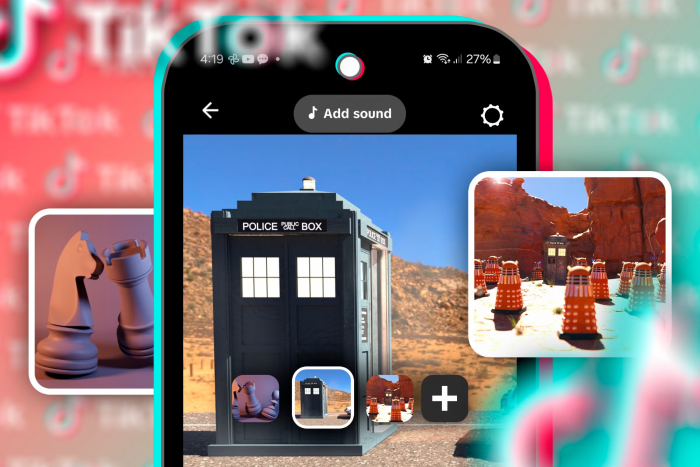
Sound is easy to treat as an afterthought on a format built from still images, but it's one of the slideshow's real advantages. Because slideshows draw from TikTok's full sound library, they get the same discovery boost video does when they ride a trending audio. A rising sound is a distribution channel, and a static post can hop on it just as easily as a video can.
Sound does two jobs here. It plugs you into whatever the algorithm is currently pushing that audio toward, and it sets emotional pacing that your still images can't. A wistful track under a "things I wish I knew" set makes the whole thing hit differently than silence would. And when the beat lands where a slide changes even loosely the swipe starts to feel scored, like the music is nudging the viewer forward. You don't need frame-perfect syncing. You need audio that matches the mood and a rough sense of where the beat sits.
Hooks, Captions and Hashtags Beyond the Slides
The slides are the story, but the caption and tags are how the story gets found and clicked. Think of them as the layer wrapped around the post. The caption's real job isn't to summarize; it's to add a second hook the first slide didn't have room for, or to pose the question that makes someone tap in to read properly. Looking at different approaches to TikTok captions can also help when the slideshow already carries most of the story and the caption only needs to add context or invite a response. A caption that repeats the first slide is wasted space; one that extends it earns the open.
On hashtags, resist the urge to stuff twenty of them. A tight mix of one or two broad tags for reach and a couple of specific ones that describe your actual niche does more than a wall of generic terms. The specific tags tell the system who this is for; the broad ones give it room to test the post against a wider crowd.
How the Algorithm Reads a Slideshow
You don't need to reverse-engineer the whole system, but you should know which behaviors the format naturally produces because those are the signals working in your favor.
| Signal | How the format produces it |
| Watch time / dwell | Reading text and looping the set both accumulate time on the post |
| Completion & replays | Auto-looping means slow readers rack up multiple passes without trying |
| Saves | Useful, list-style slideshows are saved to return to a strong quality signal |
| Shares | A single sharp insight or relatable slide gets sent to a friend |
| Manual swipes | Active engagement the system reads as genuine interest, not passive scrolling |
The strategic point here is that you don't chase these signals directly. You build a slideshow worth reading slowly, saving, and sharing and the signals show up on their own. Design the experience; the metrics follow. Trying to reverse that order is how people end up gaming a number and wondering why nothing lands.
Common Mistakes That Kill a Good Slideshow
Most failed slideshows aren't failing on their idea. They're failing on execution in a few predictable ways, and every one of these is fixable before you post.
● Burying the hook. Putting the interesting part on slide four assumes people got to slide four. They didn't. Lead with the sharpest thing you've got and let the rest earn its way in.
● Too many slides. Length isn't depth. Every slide that doesn't move the story forward is a place someone leaves. If a slide can be cut without losing anything, it should be.
● Cluttered text. Three ideas fighting on one slide means none of them wins. White space isn't wasted space; it's what makes the one line you care about actually get read.
● A weak or missing ending. Trailing off is the most common way to waste a good build-up. The last slide is your chance to land a takeaway or a call to swipe back, don't let it just stop.
● Mismatched sound. Chirpy audio under a serious story breaks the spell instantly. The mood of the track has to agree with the mood of the words.
Turning Slideshows Into a Repeatable System
One good slideshow is luck. A steady stream of them is a system, and the format is unusually kind to systematizing because so much of it is reusable. Once you've found a look and a framework that works, you're not starting from zero each time you're pouring new ideas into a mold that already fits.
A few moves turn this from a one-off into a habit. Batch the boring parts: set your fonts, text placement, and color treatment once and save them as a template so every new post starts halfway done. Keep a running note of ideas the moment they hit, because the hardest part is rarely making it's remembering the idea you had in the shower. And treat your own analytics as a map: when one framework or hook style outperforms, don't marvel at it, repeat it with a new topic. The creators who look prolific usually aren't working harder. They've just stopped rebuilding the wheel every time.
The Verdict: Simplicity as the Actual Skill
The reason slideshows unsettle people is that they strip away the things creators hide behind. No jump cuts to fake energy, no B-roll to fill dead air, no editing wizardry to distract from a thin idea. What's left is the idea and the way you tell it which was always the part that mattered. The swipe just makes it impossible to fake. Get the story right and a stack of photos will outrun a week of video edits. That was never the format being generous. That was you finally being forced to do the one thing that counts, and doing it well.
Comments