

A carousel doesn't win on the strength of one slide. It wins on whether slide six was good enough to make you tap for slide seven. It's tempting to obsess over how the slides look. That's the wrong thing to stare at. A carousel is not a slideshow you decorate, it's a chain of small decisions, and the only decision that matters is whether the reader swipes to the next slide or drops the phone.
So a real LinkedIn carousel strategy isn't about design polish. It's about swipe-through rate: the percentage of people who make it from the cover to the close. Nobody reads your best point on slide nine unless slide eight forced them there. Everything below is built around that one uncomfortable fact.
Why the Carousel Punches Above Its Weight on LinkedIn
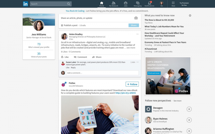
A LinkedIn carousel is technically just a multi-page PDF; the platform calls it a document post but in the feed it behaves like a trap for attention. A normal text post gets skimmed in two seconds. A carousel asks for a tap, then a swipe, then another, and every one of those actions keeps the reader parked on your post instead of scrolling away.
That dwell time is the whole game. LinkedIn's feed leans heavily on how long people engage with something and how much they interact with it, and a carousel manufactured both by design. Ten slides that each hold attention for a few seconds add up to far more time-on-post than any single graphic could buy you.
This is why a mediocre idea in carousel form often outperforms a sharp idea posted as plain text. The format is doing work the writing didn't have to. That's also the trap it's easy to assume the format alone will carry you, and it won't past slide two.
The format doesn't reward what you made. It rewards how long you kept them.
Slide One Is 90% of the Battle
Your cover has exactly one job, and it isn't to look pretty. It's to stop the scroll and make opening the thing feel obviously worth it. If it fails there, nothing else you built matters, because it never gets seen.
A strong cover does three things at once: it makes a clear promise, it hints at a tension worth resolving, and it leaves zero doubt about who it's for. Vague, clever, or beautiful-but-empty covers all lose to a plain one that says exactly what the reader will walk away with.
| The cover slide | Weak version | Strong version |
| The headline | “Thoughts on content” no promise, no stakes | “Your carousels die on slide 2. Here's why.” names a pain |
| Who it's for | Everyone, so nobody | Obvious in five words |
| The hook | States a topic | Opens a gap the reader needs closed |
| The visual | Busy, competing elements | One focal point, big legible text |
None of the strong-version wins are about design skill. They're about clarity and tension. You can make a winning cover in a plain template if the hook wording. Use hashtags as discovery, not decoration is doing its job.
If the cover doesn't earn the tap, nothing behind it exists.
The Promise You Make Before They've Read a Word
Every cover is a contract, whether you meant it to be or not. The layout, the contrast, the first line they all quietly tell the reader what they're about to get and how much effort it'll cost. People swipe based on that implied payoff, then hold you to it.
Get the calibration wrong in either direction and you lose. Overpromise, and they bounce around slide three when the payoff doesn't show up and that early drop-off tanks the whole post's reach. Underpromise, and they never open it in the first place.
The fix is boring but reliable: promise precisely what your final slides actually deliver. If your carousel is a solid tactical checklist, say so plainly. Don't dress it up as a life-changing revelation, and don't undersell it as “a few notes.” Match the label to the contents.
Promise exactly what slide ten delivers no more, no less.
Momentum Is the Only Metric That Matters
Here's the reframe that changes how you build the middle. Impressions are a vanity number handed to you by the feed. Swipe-through rate how far people actually get before they quit is the number that tells you whether your carousel works.
Think of the middle slides as links in a chain. Each one has a single job: sell the next swipe. Not “convey information,” not “look complete” sell the swipe. The moment one link fails, the reader stops, and every brilliant slide after it becomes invisible.
This is why carousels rarely die at the end. They die in the middle, at the first slide that felt skippable. Build every interior slide asking one question: does this make leaving feel like missing something?
Every slide is auditioning for the right to show you the next one.
One Idea Per Slide, No Exceptions
A slide that tries to make three points hands the reader a place to stop. Two of the points get half-read, the third gets skipped, and the effort of parsing it all becomes the excuse to put the phone down. Density feels generous; it actually pushes people away.
The discipline here is subtraction, not addition. One idea, expressed as cleanly as you can manage, then move it to the next slide. If a slide has a second thought fighting for space, that second thought is a slide of its own.
A quick way to test it: read a slide and ask what single thing it's saying. If you need the word “and” to answer, split it. Ten lean slides beat six crowded ones every time, because lean slides keep the thumb moving and crowded ones invite a pause.
A slide that says two things gives the thumb permission to stop.
The Open-Loop Engine
This is the actual mechanism behind the swipe, and it has nothing to do with how the slide looks. A closed slide one that neatly finishes its thought gives the reader a natural exit. An open slide leaves a small itch that only the next slide can scratch.
You create that pull on purpose. A few ways that reliably work:
– End a slide mid-thought. Set up the idea, then break the line right before the resolution “and the reason this fails has nothing to do with your design…” so the swipe is the only way to get relief.
– Flag a mistake before you explain it. “Most people get the next part backwards” makes the reader need to check whether they're one of them. Curiosity plus a little ego does the work.
– Number the payoff, then delay it. “Three things fix this. The third is the one nobody does.” Now they're swiping to slide nine whether the middle slides earn it or not.
Used well, open loops turn a carousel into something closer to a short story than a report. Used clumsily, they read as bait so the resolution on the next slide has to actually satisfy. Tease, then pay off. Tease, then pay off.
End each slide a half-second before the reader is ready to leave.
Design That Gets Out of the Way
The goal of carousel design isn't to look designed. It's to make reading effortless on a phone held at arm's length on a crowded train. Every bit of visual friction is a reason to quit, and the reader quits without ever knowing why.
You don't need to be a designer to clear that bar. You need to remove obstacles:
– Size the text for a thumb, not a monitor. If you'd squint at it on your own phone, it's too small. Big type isn't unsophisticated, it's the difference between read and skipped.
– Keep the layout identical slide to slide. When the title always sits in the same place and the body always follows, the eye stops re-learning where to look and just reads. Novelty in layout is friction disguised as creativity.
– Respect the thumb zone. Don't bury key words in the bottom corners where a thumb covers them mid-swipe, and leave breathing room so nothing feels cramped against the edges.
– Commit to one focal point per slide. One headline, one supporting line, maybe one visual. The instant a slide has two things competing to be looked at first, you've slowed the reader down.
Consistency is the quiet superpower here. A carousel where every slide feels like the same world lets the reader spend all their attention on your ideas instead of on decoding your layout.
Good carousel design is invisible; you only notice the bad kind.
Pacing: The Rhythm Between Slides
A carousel where every slide carries the same weight reads like a form you're filling out. What keeps a reader moving is rhythm, the same thing that keeps a good video watchable. Dense slide, then a one-line breather, then a punchy visual, then back to substance.
Think of it as editing, not template-filling. A heavy, information-rich slide earns its keep, but three in a row exhaust the reader. Drop a short, almost blunt slide after a dense one and you give them a beat to catch up, which paradoxically makes them more willing to keep going.
Vary the shape as much as the weight. A slide that's just seven words in the center hits differently after a slide packed with detail, and that contrast is what makes the whole thing feel alive instead of like homework.
Vary the weight of your slides or the whole thing reads like a form to fill out.
The Second-to-Last Slide Is Your Real Climax
It's easy to bury your sharpest insight somewhere in the middle, where it either gets skimmed or never reached. That's a waste of your best material. The slide with the most attention on it, other than the cover, is the one right before the penultimate slide.
By the time someone has swiped that far, they've self-selected into your most engaged readers. They're paying attention, they trust you enough to have stayed, and they're primed for a payoff. That's exactly where your strongest line, your biggest reframe, or your most memorable takeaway belongs.
Save the actual ask for the final slide, but land your best punch just before it, at peak attention. Give the reader the thing they'll screenshot, then ask them to do something with the feeling you just created.
Spend your best line where attention is highest, not where it's convenient.
The Ask, Without the Beg
The final slide is where a lot of carousels fall apart, either by asking for nothing or by asking for everything. “Like, comment, share, follow, and check my link” gives the reader five things to do, so they do none of them. A scattered ask reads as need, and need repels.
Pick one action and tie it to a reason. Different asks suit different goals, and it helps to know which you're actually after:
| The ask | Best when | Why it works |
| “Save this” | The carousel is a reference people will want later | Saves signal lasting value and quietly boost reach |
| “Follow for more” | You post this kind of thing consistently | Only earns the follow if the carousel proved the pattern |
| Prompt a comment | You want conversation and reach | A specific question is easier to answer than “thoughts?” |
The trick is that the ask should feel like a favor to them, not to you. “Save this so you're not rebuilding your next carousel from scratch” beats “please follow” because it hands the reader a reason that serves the reader.
Ask for one thing, give one reason, and then stop talking.
What Happens the Moment They Stop Swiping
The swipe ending isn't the post ending. It's the moment the post's second life begins. A carousel that landed well sends the reader off to do something, save it, share it to a colleague, drop the comment you prompted and each of those actions feeds back into how far LinkedIn pushes the post.
This is why the close matters more than it looks. A save tells the algorithm this was worth keeping. A share puts you in front of an audience you didn't have. A comment restarts the engagement clock and pulls the post back into feeds. The last slide isn't a goodbye; it's the trigger for all of that.
So stop thinking of the CTA as the finish line. It's the handoff the point where you convert a swipe into a signal that buys your next carousel a bigger starting audience.
The last swipe isn't the end of the post it's the start of its reach.
The Caption Does Half the Work
Here's the part that's easy to treat as an afterthought and shouldn't be: the text above the carousel. Before anyone sees slide one, they see the first line or two of your caption in the feed. That's the hook before the hook, the thing that earns the tap that lets your cover do its job.
The caption is also the part LinkedIn can actually read. Your slides are images to the platform; your caption is text it indexes and uses to understand what your post is about. Treat it as throwaway and you've capped both your click-through and your discoverability in one move.
Write the first line to create a gap, not to summarize. “I audited 40 carousels last month. The ones that flopped all shared one habit.” earns the tap. “Here is my carousel about carousels.” does not. Then let the rest of the caption give context and, quietly, the keywords you want to be found for.
The caption is the hook before the hook write it last, weight it first.
Getting Found: The Discoverability and SEO Side of Carousels
Carousels don't just live in the feed for a day and vanish. LinkedIn increasingly surfaces older posts through its own search and through Google, which means a carousel written with discoverability in mind keeps pulling in readers long after it's left the feed. That's the SEO layer of a LinkedIn carousel strategy, and it's the part that's easiest to leave on the table.
You build for it in the places the platform can read mainly the caption and the way you phrase your hooks:
– Write hooks the way people search. Phrases like “LinkedIn carousel strategy” or “why my carousels get no engagement” match how someone would actually type a question, which makes your post the answer they land on.
– Use Linkedin hashtags as discovery, not decoration. A few specific, relevant tags help the right niche find you; a wall of broad ones dilutes the signal and helps no one. Three sharp tags beat fifteen generic ones.
– Front-load the keyword naturally. Get your main topic into the first line of the caption where both readers and the platform weight it most without stuffing, which reads as spam to people and to the algorithm alike.
– Give the file and title real words. A descriptive document title does more for search than “final_v3.pdf,” and costs you nothing.
None of this replaces good slides. It compounds them. A great carousel that's discoverable earns readers twice once in the feed, and again every time someone searches the thing it answers.
A carousel that can't be found is just a slideshow with good intentions.
Reading a Carousel Like the Algorithm Does
When a carousel underperforms, the instinct is to guess at why and rebuild the whole thing. Don't guess. LinkedIn hands you the diagnostic if you know which numbers to read, and the answer is almost always a specific slide, not the whole post.
Stop watching impressions and start watching where people quit. The metrics that actually tell you something:
| What you see | What it's telling you | What to fix |
| High impressions, low swipes past slide 1 | The cover is fine but the second slide breaks the promise | Rewrite slide 2 to pay off the cover fast |
| Steady drop-off in the middle | A slide there feels skippable a weak link in the chain | Find the exact slide, add an open loop or cut it |
| Good swipe depth, few saves | People read it but didn't find it worth keeping | Sharpen the payoff and the ask on the last two slides |
| Saves high, follows flat | The carousel delivered but you didn't prove a pattern | Make consistency visible; give a reason to follow |
The slide-2 cliff is the most common failure of all: a strong cover writes a check, the second slide can't cash, and half your readers leave before they've really started. Treat that drop-off number as your first stop every time, because fixing one slide is far cheaper than remaking ten. Rough benchmarks for swipe depth and save rate float around online, but they shift by niche and over time, so trust your own trend line over anyone's stat.
Don't guess why it flopped find the slide where the swiping stopped.
The Last Swipe
Pull all of this together and it stops being about slides at all. A carousel is a sequence of tiny yeses, yes I'll tap, yes I'll swipe, yes again, yes once more and your entire job is to make each next yes easier than putting the phone down.
That's the shift. Stop asking “do my slides look good” and start asking “does slide four earn slide five.” Design the decisions, not the decoration. Win enough of those small yeses in a row and the save, the follow, and the reach take care of themselves.
Stop designing slides. Start designing the next yes.
Comments