

Why Stories ads are their own animal
Here’s the thing almost every guide gets wrong from the first sentence: it treats a Stories ad as a Feed ad turned sideways. It isn’t. The competition is different, the mindset is different, and the physics of attention are different.
When your ad appears in the Feed, it sits next to other ads and posts a person chose to scroll toward. In Stories, your ad drops in between two things: a person actually wanted to see their friend’s dog, their cousin’s engagement, a creator they follow. You’re not interrupting content. You’re interrupting a relationship. That single fact should shape every decision that follows.
The second difference is speed. A Stories viewer is in a forward-leaning, tap-happy state. The thumb is already hovering over the right side of the screen, primed to skip. You don’t get the leisurely two-second grace period the Feed sometimes grants. You get a beat, maybe two, and often the tap-forward happens before your second frame has even finished loading.
And the third: sound behaves differently here. In the Feed, most people scroll muted. In Stories, a meaningful share of viewers keep the sound on because they arrived expecting immersive, full-screen, one-at-a-time content. That doesn’t mean you should rely on audio you shouldn’t but it does mean sound is an asset in Stories in a way it rarely is elsewhere.
THE REFRAME Stop asking “how do I make my Feed ad vertical?” Start asking “what would earn a place between two things this person genuinely wanted to watch?” That question alone will kill most of your bad ideas before they cost you money. |
Before you touch Ads Manager: strategy first
The rush to open Ads Manager and start uploading is where most budgets quietly bleed out. A Stories ad without a strategy behind it is just an expensive Story. So before any design happens, three decisions need to be settled.
1. Pick the objective, and understand it’s permanent
In Meta’s system, the campaign objective is the one setting you cannot change after launch. It tells the algorithm what a “good outcome” looks like, and everything downstream who sees the ad, how the budget is spent, what you can even measure flows from it. Meta has boiled its objectives down to six, and each maps to a stage of the customer journey:
| Objective | What Meta optimizes toward | When Stories placement makes sense |
| Awareness | Cheapest possible reach and impressions | Strong fit immersive full-screen builds memory |
| Traffic | Clicks to a destination | Decent, but expect lower intent than Feed clicks |
| Engagement | Interactions, video views, messages | Good for interactive formats (polls, stickers) |
| Leads | Form fills or instant-form submissions | Works, but the swipe-to-form friction is real |
| App Promotion | Installs and in-app events | Strong the format suits demo-style video |
| Sales | Purchases and conversions | Best as part of a broader placement mix, not solo |
The honest advice here: don’t force a hard-sell objective onto a placement built for a soft, scrolling moment. Stories tend to shine at the top and middle of the funnel, discovery, curiosity, brand memory and get expensive when you demand a bottom-of-funnel purchase from a cold audience mid-scroll.
2. Decide who, but resist the urge to over-slice
The instinct of most beginners is to narrow the audience to a razor’s edge age 27 to 34, interested in yoga, lives within 12 miles, owns a dog. In 2026 that instinct is usually wrong. Meta’s delivery engine now performs best with broader audiences and diverse creative, because it has the machine learning to find the right people itself if you give it room to move. The lever that used to be targeting has largely become creative. You steer with what you make, not who you exclude.
3. Match the creative to the funnel stage before you design anything
A cold audience meeting your brand for the first time needs a different ad than someone who already abandoned a cart. This isn’t a nice-to-have; it’s the difference between an ad that feels like a welcome and one that feels like a stranger shouting a discount code. Sketch this out before you open any design tool:
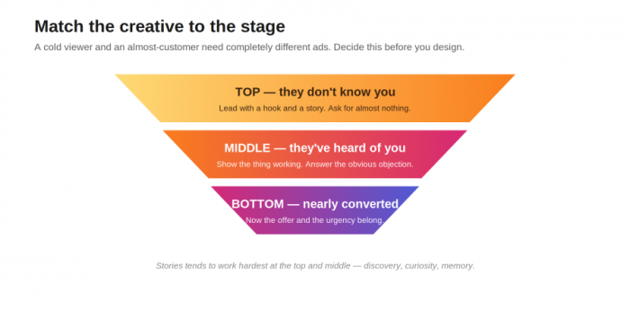
• Top of funnel (they don’t know you): lead with a hook, a story, or a genuinely useful idea. Ask for almost nothing. The goal is a stopped thumb and a remembered name, not a sale.
• Middle of funnel (they’ve heard of you): demonstrate the thing. Show the product doing its job, answer the obvious objection, build enough trust that a click feels reasonable rather than risky.
• Bottom of funnel (they nearly converted): this is where urgency, a specific offer, or a reminder of what they left behind actually belongs and nowhere earlier.
The build, step by step
A quick note before the walkthrough: Meta merged its old “manual” and “Advantage+” campaign flows into a single unified interface, so if you’re following a guide from a couple of years ago, the screens won’t match. AI-assisted optimization is now the default path, not a special mode you opt into. Here’s the current shape of it.
1. Open Ads Manager and create a new campaign. You’ll land on the objective selection first. Choose based on the strategy work you already did remember, this is the one door that locks behind you.
2. Set the campaign-level budget and let the Advantage tools stay on (mostly). The unified flow nudges you toward automated budget, placements, and audience. For a first campaign, leaning into these is usually right. There’s now an “Opportunity Score” rating how well your setup uses Meta’s automation to treat it as a hint, not gospel.
3. At the ad-set level, handle audience, schedule, and placement. This is where the Stories decision lives.
4. Choose your placement approach. You have two real options, and the choice matters more than it looks:
| Metric | Advantage+ Placements (automatic) | Manual Placements |
| What it does | Lets Meta spread your ad wherever it’s cheapest to hit your goal | You hand-pick exactly where the ad runs |
| Best for | Most campaigns, especially with creative in multiple ratios | Vertical-only creative, or excluding certain surfaces |
| The catch | Your 9:16 masterpiece might get shown as a cropped square | You may pay more per result by boxing the algorithm in |
Here’s the wrinkle that trips people up: if you want a pure Stories campaign, select manual placements and tick only Stories. But if your creative is genuinely built for full-screen vertical, automatic placements will often find cheaper results elsewhere and quietly serve a cropped version. The fix isn’t to fight the algorithm, it's to give it properly sized assets for every placement so it never has to crop.
5. At the ad level, upload your creative and write your copy. Primary text, headline, a call-to-action button, and destination URL all live here. Preview it in the Stories placement specifically not the default Feed preview so you see what the viewer actually sees.
6. Turn on the Safe Zone Guardrail. This overlay shows exactly which parts of your creative hide behind Instagram’s interface. It takes under two minutes and saves you from the single most common creative failure. Skipping it is how you bury a headline under a CTA button.
7. Publish but launch paused if you’re reviewing with anyone. Then let it run untouched long enough to exit the learning phase, which brings us to a rule people constantly break, covered under measurement below.
Specs, safe zones and the mistakes nobody warns you about
The dimensions are the easy part. It’s what happens after you get them slightly wrong that costs you, because Meta rarely rejects a mis-sized ad it silently crops it, which is worse. You never get an error. You just get quietly worse results and have no idea why.
| Spec | The number | Why it bites you if ignored |
| Resolution / ratio | 1080 × 1920 px, 9:16 | Below 1080px wide looks visibly soft on modern screens |
| Video format | MP4 or MOV, H.264 | HEIC, MKV, and AVI fail the upload outright |
| Video bitrate | 3,500 kbps min (5–8k recommended) | Low bitrate passes upload but gets lower delivery priority |
| Duration | 1–60 seconds per card | Longer stories fragment across multiple cards |
| File size ceiling | 30 MB images / 4 GB video | Over ceiling = rejected; over ~1 GB = slow to process |
That bitrate line deserves a second look, because it’s the sneakiest one. A heavily compressed video uploads without complaint, no warning, no flag but Meta’s quality scoring reads low bitrate as a poor viewing experience and hands your ad worse delivery. You’re penalized for a setting you didn’t know you were choosing.
The safe zone is where good creative goes to die
As of 2026, Meta consolidated Stories and Reels into a single unified safe zone, which at least means one set of rules instead of two. On a 1080 × 1920 canvas, keep everything that matters out of these regions:
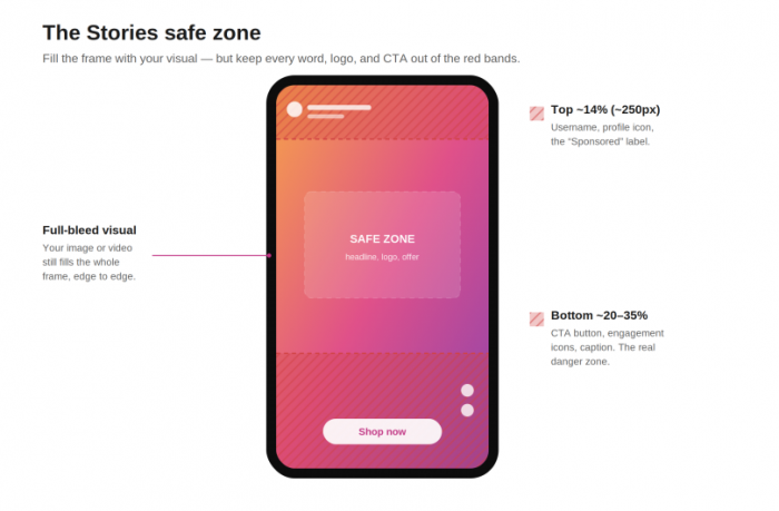
• Top ~14% (roughly 250px): where the profile icon, your username, and the “Sponsored” label sit. Put a headline here and it competes with clutter.
• Bottom ~20–35% (roughly 340–670px): the danger zone. Your CTA button, engagement icons, and caption all live here exactly where beginners love to place their most important text, and exactly where it gets covered.
• Each side ~6%: a smaller margin for device-edge variance, worth respecting for anything you can’t afford to have clipped.
THE COUNTERINTUITIVE PART You should still design your visuals to fill the entire frame, edge to edge a full-bleed image or video is what makes the ad feel native and immersive. It’s only your critical elements: text, logo, the offer, the CTA that need to stay inside the safe zone. Full-bleed background, safe-zone message. Get that distinction right and you’ve beaten most advertisers already. |
Creative that actually earns the tap
This is the section that decides whether any of the above mattered. You can nail every spec and pick a flawless objective and still make an ad that gets skipped in half a second. Here’s what separates the ones that hold attention.
Front-load everything
The format rewards immediate context in the first one to two seconds, and a visible call-to-action before the five-second mark because a large share of viewers tap forward before then. This flips classic story structure on its head. You don’t build to a reveal. You lead with it. Whatever your best moment is, it belongs at the front, because most people will never reach the back.
The same principle applies to the supporting copy: a strong visual can stop the tap, but weak wording can still lose the response. The way you structure Instagram captions for stronger engagement matters here too, especially the opening line and CTA.
Design for sound-off and sound-on at the same time
Treat audio as a bonus, never a crutch. Anyone watching muted should understand the whole message from visuals and text alone. But anyone watching with sound more common in Stories than the Feed should get something extra: music that sets a mood, a voice that adds warmth, a sound effect that punctuates. Burn your captions in rather than relying on auto-captions if the message truly depends on the words.
Look native, not polished
This is the take that gets the most pushback, so let me be direct: in Stories, an ad that announces itself as an ad often loses. Highly produced, glossy, obviously-a-commercial creative triggers the same reflex that makes people skip ads on TV. The content people came to Stories for is raw shot on a phone, a little imperfect, human. Creative that matches that texture slips past the skip reflex. This doesn’t mean sloppy. It means intentional imperfection that reads as authentic rather than a corporate polish job dropped into a personal feed.
Move in the first frame
A static opening frame is an invitation to tap forward. Motion, a gesture, a reveal, a change in the very first frame gives the eye a reason to stay for the next one. Even for a static-image ad, choose the frame with the most implied movement or the strongest visual tension.
A simple checklist to run before you publish
Before any Stories ad goes live, walk it through these five questions. If it fails even one, it’s not ready:
1. The mute test: watch it with sound off. Do you still get the message? If not, fix the visuals, not the audio.
2. The one-second test: pause at the one-second mark. Is there already a reason to keep watching? If the hook arrives at second three, you’ve lost most of your audience.
3. The safe-zone test: is every critical element clear of the top and bottom overlays? Check in the actual Stories preview, not the Feed one.
4. The native test: if this appeared between two friends’ Stories, would it feel like a jarring corporate intrusion or a natural continuation? Aim for the latter.
5. The skip test: honestly would you tap forward? If yes, so will they.
A quick teardown: one that works, one that doesn’t
Principles are easier to trust when you can see them play out. Here’s the same imaginary product a subscription coffee brand built two ways.
✓ THE ONE THAT WORKS Frame 1 (0–1s): a close, phone-shot coffee pour, steam rising, filmed vertically. Text in the top safe zone: “Your 6am, upgraded.” Immediate context, motion, no logo yet. Middle (2–4s): a quick cut to someone enjoying it at a messy kitchen counter. Feels like a friend’s Story, not a set. End (5s+): the offer “First bag free” appears above the CTA button, clear of the overlay. Sound is nice but not required. | ✗ THE ONE THAT DOESN'T Frame 1: a static studio product shot on white, logo centered. Looks like a catalog page. Nothing moves, nothing invites. Middle: three lines of feature copy you’d need sound and patience to absorb and the viewer has neither. End: the discount code sits in the bottom 20%, half-hidden behind the CTA button. The one thing that might convert is the one thing they can’t read. |
The difference isn't the budget. Both could cost the same to make. The winning version simply understood where it was going to appear and who was going to see it. The losing one was designed in a vacuum and dropped into Stories as an afterthought.
Measuring the right things
Plenty of Stories campaigns get judged by the wrong number and killed or scaled for the wrong reason. Separate the metrics that reflect real performance from the ones that just feel good.
| Metric | What it actually tells you | Weight it deserves |
| Hook rate / 3-sec views | Whether your first frame is doing its job | High the Stories metric |
| CTR (link) | Whether the creative earned real interest | High |
| CPA / cost per result | What each outcome truly costs you | High the bottom line |
| CPM | What it costs to be seen | Medium context, not verdict |
| Impressions / reach | How many eyeballs, nothing about quality | Low the vanity trap |
The same distinction matters beyond paid campaigns. Looking at social media ROI beyond likes and follows helps separate activity that looks impressive from content that actually produces clicks, leads, or revenue.
For rough context on where Stories tends to land: it often delivers a strong click-through rate thanks to that immersive full-screen format, and historically some of the lower cost-per-click figures across Meta placements though costs vary wildly by industry and audience, so treat any benchmark as a loose reference point rather than a target.
THE RULE PEOPLE BREAK CONSTANTLY When results look bad early, the reflex is to lower the budget. Don’t. Cutting the budget on a struggling ad set forces it back into Meta’s learning phase and resets the algorithm’s progress. If an ad set genuinely underperforms after it’s had room to stabilize, turn it off rather than starving it. Kill it or leave it don’t squeeze it. |
A simple testing loop
You don’t need a complicated experimentation framework. You need a repeatable habit:
• Run 3–5 creative variations per ad set at once, changing one meaningful thing at a time the hook, the format, the offer so you can tell what actually moved the number.
• Give it enough time and spend it to exit the learning phase before you judge anything. Early numbers are noise.
• Keep the winner, replace the losers, and note why the winner won so the insight compounds across campaigns instead of evaporating.
Myths worth unlearning
A few beliefs that sound sensible and quietly sabotage campaigns:
• “More polished always means more professional.” In Stories, over-production frequently underperforms native, phone-shot creative. The goal is trust, and trust reads as human, not glossy.
• “Tighter targeting means better results.” In 2026, over-segmentation usually hurts. Broad audiences plus strong, varied creative is the pattern that wins now the creative is the targeting.
• “A vertical Feed ad is a Stories ad.” Same pixels, different world. If you didn’t design for the safe zone, the skip reflex, and the sound-on possibility, you made a Feed ad that happens to be tall.
• “Lower the budget when it’s not working.” As above, this resets learning and often makes things worse. Pause or replace instead.
• “Sound doesn’t matter because everyone’s muted.” True in the Feed, less true in Stories design for silence, but reward the ones who listen.
FAQs
1. Can I run a Stories ad without making a separate video?
Yes static image Stories ads work at the same 1080 × 1920, 9:16 spec. Just give the frame implied motion or tension so it doesn’t read as a dead pause, and keep your message out of the safe zone.
2. Should I use automatic or manual placements for Stories?
For most campaigns, automatic placements find cheaper results if you supply properly sized creative for each placement so nothing gets cropped. Go manual only when you have vertical-only creative or a specific reason to exclude certain surfaces.
3. How long should a Stories ad be?
Shorter than you think. You can run up to 60 seconds per card, but the meaningful action happens in the first few seconds. If your point isn’t clear by second five, length won’t save it.
4. Do I really need captions if the message is visual?
If the ad makes complete sense muted, you can skip them. The moment any part of the message lives in the audio, burn in captions you’re otherwise losing every sound-off viewer.
5. Why do the specs and interface keep changing?
Meta tweaks the edges every year placement definitions, safe zones, the campaign flow. The core vertical ratios stay stable, but before a big launch it’s worth a two-minute check against Meta’s own current documentation.
The verdictIf there’s one idea to carry out of all this, it’s the reframe from the very start: a Stories ad isn’t a Feed ad standing up. It’s a guest that showed up uninvited between two things someone actually wanted to watch and its entire job is to earn the right to be there before the thumb moves. Almost everything practical flows from that. Front-load the good part because the tap is coming. Fill the frame but keep your message in the safe zone. Look like a person, not a billboard. Let the algorithm breathe instead of micromanaging it. And judge the whole thing by whether real people clicked and converted not by how many technically saw it. The specs will drift. The interface will get another refresh. But the underlying task doesn’t change: make something worth not skipping. Get that right, and the rest is just settings. |
Comments