

A single emoji can make a caption feel warmer, friendlier, or easier to scan. Add too many, though, and the same caption can start to feel forced, noisy, or strangely promotional. The difference is not simply how many emojis appear. It is whether they are helping the message or competing with it.
Good emoji use comes down to purpose. A well-placed symbol can clarify tone, highlight practical information, or give a caption a little personality. Poorly chosen emojis usually do the opposite. They interrupt reading, repeat the same emotional cue, or make a serious message feel less credible. The goal is not to remove emojis from captions, but to use them in a way that improves the writing rather than decorating it for the sake of decoration.
Why Emojis Change the Way a Caption Feels
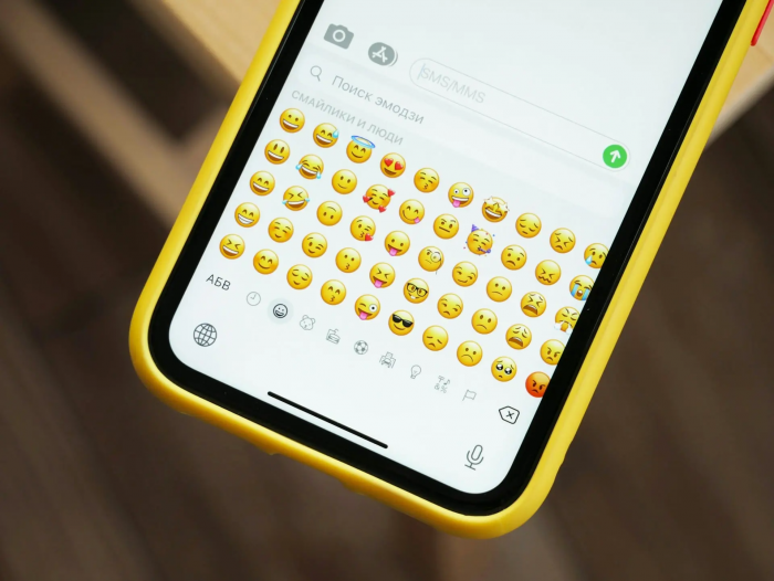
Written captions are limited because they do not include voice, facial expression, timing, or body language. In conversation, a raised eyebrow or smile can change the meaning of a sentence without changing the words. On social media, emojis often take on part of that role.
Consider the sentence, “We finally finished it.” On its own, it sounds neutral. Add 🙌 and it becomes celebratory. Add 😅 and it sounds relieved. Add 👀 and the sentence suddenly feels teasing, as if something else is coming next. The words remain the same, but the emotional interpretation changes.
That is why emojis should not be treated as random visual extras. They are part of the sentence. They can influence whether a caption feels warm, playful, sarcastic, serious, proud, or overly enthusiastic.
| Caption | Likely impression |
| New collection is live. | Neutral and direct |
| New collection is live ✨ | Warm and celebratory |
| New collection is live 👀 | Curious and slightly teasing |
| 🔥✨😍 New collection is live!!! 🚀💯 | Loud and overly promotional |
A useful question before adding any emoji is simple: What does this symbol change about the way the sentence is read? If the answer is nothing, it probably does not need to be there.
Useful Emojis and Decorative Emojis Do Different Jobs
Not all emojis perform the same function. Some are practical. Others mainly create mood.
Functional emojis help organize information. A location pin before an address, a calendar before a date, or a clock before a time gives readers an immediate visual clue. These symbols can make longer captions easier to skim because they act almost like tiny labels.
For example:
● 📍 can help readers find a location quickly.
● 📅 works well before a date or event schedule.
● ⏰ can make a time easier to spot.
● ✅ is useful for requirements, completed steps, or checklists.
● 🔗 can draw attention to a link instruction or action.
Decorative emojis work differently. Symbols such as ✨, 🤍, 🌸, 💫, and 🔥 usually do not add factual information. Their role is to influence tone or aesthetics.
There is nothing wrong with using decorative emojis. A beauty creator, fashion brand, or lifestyle account may use them naturally because they fit the visual language of the account. The issue begins when every sentence gets an emoji simply because the caption feels incomplete without one. At that point, the symbols stop adding personality and start becoming a habit.
How Many Emojis Is Too Many?
There is no reliable universal number. A rule such as “never use more than three emojis” sounds simple, but it ignores caption length and purpose.
A 15-word caption with five emojis can feel crowded. A 250-word event caption might use five emojis without feeling excessive if each one introduces a different detail. What matters more than the raw number is emoji density.
Compare these two versions:
New episode is live 🎙️
We talked about creator burnout, pricing, and what happens when content becomes a full-time job.
Listen here 👇
Now compare:
New episode 🎙️ is live 🔥 and we talked 💬 about creator burnout 😩 pricing 💰 and content creation 📱 so go listen 🎧 now 👇
The second version is harder to read because the eye has to switch between text and symbols every few words. None of the emojis is disastrous on its own. The problem is that there are too many competing signals packed into a small amount of text.
A better way to judge quantity is to ask whether each symbol has a distinct role. If several emojis are all communicating excitement, one is usually enough. If four emojis identify four different pieces of practical information, they may all be useful.
Placement Matters More Than Most People Realize
Where an emoji appears can affect readability almost as much as which emoji is used. The end of a sentence is usually the safest place because the reader can finish the thought before processing the visual cue:
We have been working on this launch for months. Excited to finally share it 🙌
The emoji reinforces the emotion without interrupting the sentence.
Beginning a line with an emoji works well when the symbol acts as a label:
📍 Mumbai
📅 October 17
⏰ 6:30 PM
🎟️ Registration required
This kind of formatting is effective because it helps readers scan. Someone who only wants the location or time can find it immediately.
The weakest placement is often the middle of a sentence when emojis are inserted too frequently:
We spent three months 🗓️ working on a completely new ✨ collection that we cannot wait 😍 to show everyone.
The sentence is still understandable, but the symbols create unnecessary pauses. One occasional emoji in the middle can work, especially in highly casual writing, but repeated interruptions make captions feel less natural.
Match the Emoji to the Emotion Already in the Caption
Strong captions establish tone through the words first. Emojis should reinforce that tone rather than trying to create it from nothing.
Consider this announcement:
Version 2.0 is finally live. Huge credit to everyone who helped get it over the line 🙌
The emoji fits because the language already communicates achievement and gratitude. Now look at this version:
Version 2.0 is finally live!!! 🚀🔥💯😍🎉✨
This is much louder, but not necessarily more expressive. Several emojis are repeating the same broad idea: excitement.
The mismatch becomes more serious when the subject itself is sensitive. A company posting about a service outage, customer complaint, policy issue, apology, or layoffs should be careful with playful symbols. An emoji that is meant to make the brand seem approachable can make the message feel dismissive. Tone should come from the writing. Emojis work best as support.
Emoji Use Should Change by Platform
Different platforms have different communication habits. A caption that feels normal on TikTok may feel excessive on LinkedIn, even if the exact wording is the same.
| Platform | Better emoji approach |
| More expressive use usually feels natural, especially for creators and lifestyle brands. | |
| TikTok | Casual, conversational emoji use fits the platform well. |
| Emojis work best when used selectively for emphasis or structure. | |
| Usage depends heavily on audience, page type, and post format. | |
| X | Limited space makes every symbol more noticeable, so unnecessary emojis stand out quickly. |
Platform culture matters, but audience expectations matter even more. A fashion brand may use expressive emojis across multiple platforms and still feel consistent. A legal, financial, or B2B company may need a more restrained style everywhere.
Consistency does not mean copying the exact same caption across each network. It means preserving the same personality while adapting the presentation to the space.
Personal Accounts and Brand Accounts Need Different Rules
Personal accounts have more freedom because inconsistency can feel natural. Someone may use 😂 repeatedly in one post, no emojis in another, and a heart in a personal update. That variety reflects normal communication.
Brands need more discipline because repeated patterns become part of their identity. If a company uses the same symbols in every post, followers begin to associate those emojis with the brand voice.
A luxury skincare brand may naturally lean toward ✨ or 🤍. A local café may use ☕ or 🥐. A sports brand may use 💪 or 🏃. None of those choices is automatically right or wrong. What matters is whether the symbols fit the tone the brand is trying to maintain.
Brands should think about emoji use the same way they think about wording, capitalization, and punctuation. That can include preferred symbols, symbols to avoid, how often they appear, and situations where the safest choice is not to use them at all.
Use Emojis to Improve Structure
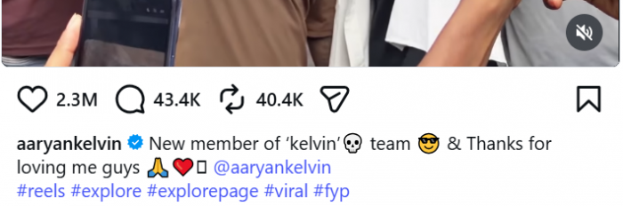
One of the most useful roles for emojis is formatting. Long captions often fail because practical details are buried inside a paragraph. Emojis can act like miniature section markers that separate information without requiring formal headings.
Consider an event caption:
Our community workshop returns next Saturday with sessions on photography, editing, and short-form video.
📅 Saturday, October 17
📍 Central Arts Hall
⏰ Doors open at 10 AM
🎟️ Free registration
Registration closes Thursday evening.
The emojis are not decorative. They reduce the amount of work the reader has to do. This works well for event announcements, product launches, restaurant information, creator schedules, educational posts, and short lists of instructions. In each case, the symbol earns its place because it improves navigation.
Repetition Weakens Emphasis
It is easy to assume that repeating an emoji makes the emotion stronger. Sometimes it does, especially in casual conversation. Two laughing emojis can feel more expressive than one. The effect quickly reaches a limit, though.
Compare:
Thank you for the incredible response ❤️❤️
with:
Thank you for the incredible response ❤️❤️❤️❤️❤️❤️❤️❤️
The second version is more visually intense, but the emotional meaning is almost identical.
The same issue appears in sales copy:
SALE 🔥🔥 Everything must go 🔥 Huge savings 🔥🔥 Shop now 🔥
When the same symbol appears everywhere, it stops functioning as emphasis. Nothing stands out because everything is being highlighted. Good visual emphasis depends on contrast. An emoji attracts attention because it is different from the surrounding text. Overuse removes that contrast.
Common Emoji Mistakes That Make Captions Feel Forced
A caption does not need a huge number of emojis to feel awkward. The wrong symbol, repeated pattern, or poor placement can do the same damage.
Several mistakes are especially common:
● Using multiple emojis for one emotion. A string such as 🔥🚀💯✨ usually communicates one broad idea rather than four separate ones.
● Adding an emoji after every sentence. Repetition quickly becomes mechanical and distracts from the writing.
● Following trends without understanding context. Online communities frequently give emojis meanings that are different from their literal appearance.
● Replacing important words with symbols. Dates, instructions, warnings, and key information should remain clear in text.
● Using playful emojis in serious communication. Tone mismatch can make a brand appear careless.
● Copying another account's style. The emoji habits of a meme page, fashion creator, lawyer, and software company should not look identical.
● Starting with a long emoji stack. Readers should not have to move past a block of decoration before reaching the message.
A good editing question is: If this emoji disappeared, would the caption lose anything? If the answer is no, removing it usually improves the post.
Emoji Meaning Is Not Always Universal
Emojis look simple, but their meanings are not always fixed. Interpretation can change by age group, culture, community, platform, and context. Some symbols have developed slang meanings that are very different from what the original icon appears to represent. Others may look slightly different across devices and operating systems.
This matters particularly for brands publishing to broad or international audiences. A symbol that feels obvious to the person writing the caption may carry a different implication for another group.
The safest principle is simple: if the information is important, write it in words. Use emojis to reinforce meaning, not to carry the entire meaning.
Accessibility Should Be Part of Emoji Editing
Emoji-heavy captions can also create accessibility problems. Sighted readers often process a long emoji string as one visual burst. Assistive technology may interpret the symbols individually, which can make the same line much more repetitive than it appears.
That is one reason to avoid long chains such as:
🎉🎉🎉🔥🔥😍😍👏👏✨✨
A better caption does not need to remove emojis completely. It simply needs to use them with more restraint.
Accessible emoji use usually means:
● Keeping long decorative sequences to a minimum.
● Writing important instructions in words.
● Avoiding symbols in the middle of every sentence.
● Making sure the caption still works if the emojis are ignored.
● Using structural emojis consistently when they introduce information.
Accessibility improves the caption for everyone because the same practices also make the text easier to scan and understand.
Write the Caption First, Then Add Emojis
One of the easiest ways to avoid overusing emojis is to change the order in which the caption is written. Write the message first. Make sure the idea, tone, and structure already work. Then add emojis where they genuinely improve the result.
Start with:
Registration closes Friday. The workshop starts at 10 AM on Saturday at Central Arts Hall.
Then improve the scanability:
📅 Registration closes Friday
⏰ Workshop starts at 10 AM Saturday
📍 Central Arts Hall
The original writing was already clear. The emojis made it faster to read.
Starting with symbols often creates the opposite process. The writer chooses an emoji first and then looks for a sentence to attach it to. That almost always leads to unnecessary decoration.
Before and After: What Better Emoji Editing Looks Like
The difference becomes much easier to see when the same caption is edited.
Before
🚨✨BIG NEWS✨🚨 We are SO excited 😍🔥 to announce that our new summer collection ☀️👗🛍️ is finally LIVE!!! 🚀💯 Tap the link 🔗 and shop now 🛒🔥✨
The caption has too many competing signals. Capital letters, exclamation marks, repeated emojis, and urgency language are all trying to attract attention at the same time.
After
Our summer collection is officially live ☀️
The range includes lightweight shirts, linen sets, and everyday basics designed for warmer weather.
Shop the collection through the link in our bio.
The second version is calmer, but it communicates more. The sunshine emoji supports the seasonal theme, while the words explain what is actually being launched.
The goal is not to make every caption plain. It is to remove the parts that are creating noise without adding meaning.
Bottom Line
Good emoji use is not about following a fixed number. It is about making sure every symbol has a reason to be there.
Emojis can clarify emotion, organize information, guide the eye, and make social writing feel more human. They become a problem when they repeat the same idea, interrupt the reader too often, or create a tone that does not fit the message.
The simplest rule is to treat emojis like visual punctuation. Write the caption so it works on its own, add symbols only where they improve meaning or structure, and remove the ones that are simply filling space. When the words remain in control, emojis add personality. When the symbols become the loudest part of the caption, they are probably doing too much.
Comments