
Napkin AI is good at one specific job: turning written ideas into simple, presentation-ready visuals. It is useful when you have a paragraph, a blog section, a business point, or a rough concept and want a diagram without opening a full design tool.
But that same focus is also its limit. Napkin AI is good but not always the best choice when you need a full slide deck, brand-controlled graphics, technical diagrams, report-style infographics, team whiteboards, or product planning maps.
That is why the best Napkin AI alternative depends on the work behind the visual. A marketer, product manager, teacher, consultant, and operations team may all need “visuals,” but they do not need the same kind of tool.
Quick Comparison
| Tool | Best For | Starting Paid Price |
| Gamma | Turning ideas into full decks and visual pages | $9/seat/month |
| Canva | Publishing-ready marketing and social visuals | Around $18/month or $144/year in USD markets |
| Visme | Reports, charts, data visuals, and branded business content | $12.25/person/month, billed yearly |
| Piktochart | Simple infographics, reports, and educational visuals | $10/member/month, billed yearly |
| Venngage | Branded infographics and professional business documents | $10/month, billed yearly |
| Miro | Team brainstorming, workshops, and visual collaboration | $8/member/month, billed yearly |
| Whimsical | Flowcharts, wireframes, mind maps, and product planning | $10/editor/month, billed yearly |
| Lucidchart | Technical diagrams, process maps, and system documentation | $9/month plus tax |
1. Gamma: Best for Turning Ideas Into Full Presentations
Gamma is the better choice when your idea cannot stop at one visual. Napkin AI works well when you want to explain a point inside a blog, report, pitch, or document. Gamma is more useful when that point needs to become a complete presentation, lesson, client deck, pitch narrative, or visual webpage.
The difference is in the final output. Napkin AI helps you create a visual inside your content. Gamma helps you create the content container itself. It can generate presentations, documents, websites, social content, and images, with exports to PDF, PPTX, PNG, and Google Slides available on its free plan. Its Plus plan adds more AI power, higher card limits, advanced AI image models, and removes Gamma branding.
| What you gain over Napkin AI | What you may miss |
| You can turn one rough idea into a full presentation, visual document, or shareable page with structure around it. | Napkin AI feels faster when you only need one clean diagram from a short paragraph. |
Pricing: Gamma has a free plan. Plus starts at $9/seat/month.
Best for: Founders, teachers, marketers, consultants, creators, and anyone turning notes into slides or visual explainers.
Quick verdict: Choose Gamma over Napkin AI if the visual is only one part of a larger presentation or story.
2. Canva: Best for Publishing-Ready Marketing Visuals
Canva is not trying to solve the same problem as Napkin AI. That is what makes it useful as an alternative. Napkin AI is better at creating visuals from text. Canva is better when the visual needs to be edited, resized, branded, published, and reused across different content formats.
This matters for bloggers, social media teams, and marketers. A Napkin visual may work inside an article or slide, but Canva is more practical when you need a blog cover, Instagram carousel, LinkedIn post, YouTube thumbnail, ad creative, newsletter graphic, presentation slide, or printable asset. Canva also gives you more control over typography, spacing, layout, colors, stock media, icons, background removal, brand kits, and design reuse.
Canva’s Pro page highlights premium content, AI tools, and design features for social posts, photos, videos, presentations, and other creative formats. Pricing can vary by country, but current USD pricing trackers list Canva Pro at around $18/month or $144/year.
| What you gain over Napkin AI | What you may miss |
| You get stronger editing control, templates, brand assets, resizing tools, stock media, and publishing formats. | Canva does not feel as instant when the job is simply “turn this paragraph into a visual.” |
Pricing: Free plan available. Canva Pro is commonly listed around $18/month or $144/year in USD markets, though regional pricing should be checked before publishing.
Best for: Bloggers, social media teams, creators, small businesses, agencies, and marketers who need final graphics, not just rough visual ideas.
Quick verdict: Choose Canva over Napkin AI if the visual needs to be designed for publishing, resized for multiple channels, or kept consistent with a brand.
3. Visme: Best for Reports, Charts, and Business Visuals
Visme is a stronger alternative when the visual needs to carry business information. Napkin AI can explain a concept quickly, but Visme is better when the content includes data, sections, charts, reports, training material, branded templates, or presentation-style assets.
This is where Visme separates itself from more casual design tools. It is built for teams that need repeatable business communication, not only attractive graphics. A sales team can use it for one-pagers and proposals. A marketing team can use it for reports and lead magnets. A training team can use it for internal guides. A consultant can use it for charts and client-ready decks.
Visme’s Starter plan includes premium assets, full access to templates and assets, downloads as JPG, PNG, and PDF, while Pro adds PPTX, HTML5, video, GIF downloads, brand kit, analytics, integrations, and privacy controls. Its AI credit system also differs by plan, with 10 credits on Basic, 200 on Starter, and 500 on Pro.
| What you gain over Napkin AI | What you may miss |
| You get stronger report layouts, charts, data widgets, branded templates, richer exports, privacy controls, and business-ready formats. | Napkin AI is still quicker when the goal is only to create one visual from a small piece of text. |
Pricing: Basic is free. Starter costs $12.25/person/month, billed yearly. Pro costs $24.75/person/month, billed yearly.
Best for: Consultants, agencies, educators, sales teams, marketing teams, and businesses creating reports or information-heavy visuals.
Quick verdict: Choose Visme over Napkin AI if the visual has to support business data, charts, reports, or branded communication.
4. Piktochart: Best for Simple Infographics and Visual Reports
Piktochart is a practical alternative when you want a clean infographic or report without building everything manually. Napkin AI is better for visualizing an idea quickly. Piktochart is better when you already know the content has to become an infographic, visual report, poster, newsletter, or educational explainer.
The strength of Piktochart is focus. It does not feel as broad as Canva or as workshop-driven as Miro. It is easier to understand: take information, choose a visual structure, make it readable, and export it. That makes it useful for people who do not want a heavy design workflow but still want more control than Napkin AI gives.
It is especially helpful for list-based explainers, “how it works” graphics, nonprofit reports, classroom material, simple data summaries, and blog visuals where clarity matters more than artistic design.
| What you gain over Napkin AI | What you may miss |
| You get cleaner infographic templates, report structures, visual hierarchy, and manual control over sections. | Napkin AI is better when you do not know the layout yet and want AI to suggest the first visual direction. |
Pricing: Free plan available. Piktochart Pro costs $10/member/month when billed annually or $15/member/month when billed monthly.
Best for: Bloggers, teachers, students, nonprofits, small businesses, and content teams creating simple visual explainers.
Quick verdict: Choose Piktochart over Napkin AI if your content needs to become a readable infographic or report, not just a quick diagram.
5. Venngage: Best for Branded Business Infographics
Venngage is a better fit when the final visual needs to look like a business asset. Napkin AI is useful for quick visual thinking, but Venngage is stronger when you need an infographic, timeline, proposal, brochure, white paper, report, or presentation graphic that feels polished and brand-aware.
The difference between Piktochart and Venngage is mostly the finish. Piktochart is good for simple information design. Venngage feels more useful when the output needs to look professional enough for a client, stakeholder, or internal business audience. Its Premium plan focuses on templates, high-resolution exports, private sharing, premium icons, and design automation. Its Business plan is more serious, adding brand kits, team sharing, PDF and PowerPoint exports, password-protected links, folders, and priority support.
| What you gain over Napkin AI | What you may miss |
| You get branded infographic templates, stronger business exports, team sharing, brand kits, and more polished document-style visuals. | Napkin AI is lighter when you only need to explain a point quickly inside another document. |
Pricing: Free plan available. Premium starts at $10/month on annual billing. Business starts at $24/user/month on annual billing.
Best for: Consultants, HR teams, agencies, marketers, business teams, and users creating client-facing infographics or documents.
Quick verdict: Choose Venngage over Napkin AI if the visual needs to look like a finished business communication asset.
6. Miro: Best for Team Brainstorming and Whiteboarding
Miro is not the right alternative if you only want another AI visual generator. It becomes valuable when the visual work happens before the final design. Napkin AI helps you generate a finished visual from text. Miro helps a team think through the idea together before that visual exists.
This makes it useful for workshops, product discovery, strategy sessions, sprint planning, journey mapping, brainstorming, retrospectives, and remote collaboration. A Napkin AI output may be the final graphic. A Miro board is usually the working space where ideas are messy, moved around, grouped, voted on, and refined.
Miro’s Starter plan unlocks unlimited private boards, visitor editing, high-resolution exports, unlimited project spaces, and blueprints. That makes it much stronger than Napkin AI for ongoing team work.
| What you gain over Napkin AI | What you may miss |
| You get shared boards, workshop tools, sticky notes, planning templates, collaboration features, exports, and a space for messy team thinking. | Napkin AI is more direct when the task is simply to convert written text into a clean visual. |
Pricing: Free plan available. Starter costs $8/member/month, billed yearly.
Best for: Product teams, remote teams, UX teams, agencies, founders, strategists, and workshop facilitators.
Quick verdict: Choose Miro over Napkin AI if the visual is part of a team planning process, not just a final graphic.
7. Whimsical: Best for Flowcharts, Wireframes, and Product Maps
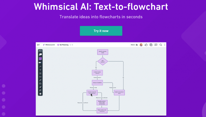
Whimsical is a strong Napkin AI alternative for people who care more about structure than decoration. It is useful for flowcharts, wireframes, mind maps, product planning, user flows, and simple documentation diagrams.
Napkin AI is better when you want the tool to interpret your text and suggest a visual. Whimsical is better when you already understand the structure and want to build it quickly. This makes it especially useful for product managers, UX teams, startup founders, and developers who need diagrams that stay editable and easy to follow.
Whimsical’s own pricing page lists Free, Pro, and Business plans. The Pro plan includes unlimited team boards, private teams, guest access, file uploads, version history, admin roles, and other team-focused features.
| What you gain over Napkin AI | What you may miss |
| You get a faster workspace for structured diagrams, flowcharts, wireframes, mind maps, product flows, and planning maps. | Whimsical is not ideal for polished marketing visuals, rich infographics, or highly designed graphics. |
Pricing: Free plan available. Pro costs $10/editor/month on annual billing, while Business costs $20/editor/month.
Best for: Product managers, UX designers, startup teams, developers, founders, and teams creating flows or wireframes.
Quick verdict: Choose Whimsical over Napkin AI if your visual needs to explain a structure, path, screen flow, or product idea clearly.
8. Lucidchart: Best for Technical Diagrams and Process Maps
Lucidchart is the most formal alternative on this list. It is not for quick visual storytelling in the same way as Napkin AI. It is for diagrams that may need to live inside documentation, operations manuals, IT planning, process audits, system maps, or business workflows.
That makes Lucidchart useful when accuracy matters. If the diagram represents an approval process, network structure, database model, org chart, customer journey, decision path, or operational workflow, Lucidchart gives more control and discipline than Napkin AI. It is closer to a professional diagramming environment than a creative visual generator.
Lucidchart offers a free trial, then its Individual plan is listed at $9/month plus tax, with unlimited documents and shapes.
| What you gain over Napkin AI | What you may miss |
| You get professional diagram controls, process mapping, system documentation support, technical templates, and more reliable structure for formal visuals. | Lucidchart can feel too serious if you only need a quick visual for a blog section or presentation slide. |
Pricing: Free trial available. Individual costs $9/month plus tax.
Best for: IT teams, operations teams, engineers, consultants, business analysts, project managers, and process-heavy organizations.
Quick verdict: Choose Lucidchart over Napkin AI if the visual needs to be accurate, documented, and useful beyond one presentation.
Which Napkin AI Alternative Should You Choose?
The right Napkin AI alternative depends on where your visual usually starts and where it needs to end.
If your work starts with rough notes and needs to become a polished story, choose a tool that can build around the idea rather than only decorate it. Gamma works best here because it turns loose thoughts into full presentations and visual documents.
If your visual is meant for publishing, choose a design-first platform. Canva is better for everyday marketing assets such as blog covers, social graphics, thumbnails, and branded posts, while Venngage is stronger when the output needs to feel more like a business document, infographic, proposal, or client-facing report.
If your content is information-heavy, look at tools built for structure. Visme is better for reports, charts, and business presentations, while Piktochart is easier for simpler infographics, educational visuals, and quick visual reports.
If the visual is part of planning or collaboration, Napkin AI may feel too limited. Miro is better for group brainstorming and workshops, Whimsical is better for clean product flows and wireframes, and Lucidchart is better for technical diagrams or process documentation.
| Your Main Use Case | Best Choice |
| Turning rough ideas into a full presentation | Gamma |
| Creating social, blog, and marketing visuals | Canva |
| Building data-heavy reports and business visuals | Visme |
| Making simple infographics or visual explainers | Piktochart |
| Designing polished business infographics | Venngage |
| Running workshops and team brainstorming | Miro |
| Mapping product flows, wireframes, or mind maps | Whimsical |
| Creating technical diagrams or process maps | Lucidchart |
Final Verdict
Napkin AI is still one of the simplest options if your main goal is to turn text into quick visual explanations. It works best when you need a diagram for a blog section, presentation point, business note, or idea summary without spending time on design.
But once the visual needs a more specific job, a focused alternative makes more sense. Some users need presentation-building, some need design control, some need reports, and some need structured diagrams for teams or technical work. That is where Napkin AI starts to feel less complete.
So the best alternative is not the tool with the most features. It is the one that matches the final purpose of the visual. Use Napkin AI for fast idea visualization. Move to an alternative when the visual needs to become a deck, report, branded asset, team board, product map, or technical document.
Comments